PUBLIC REFERENCE
Mike Matas
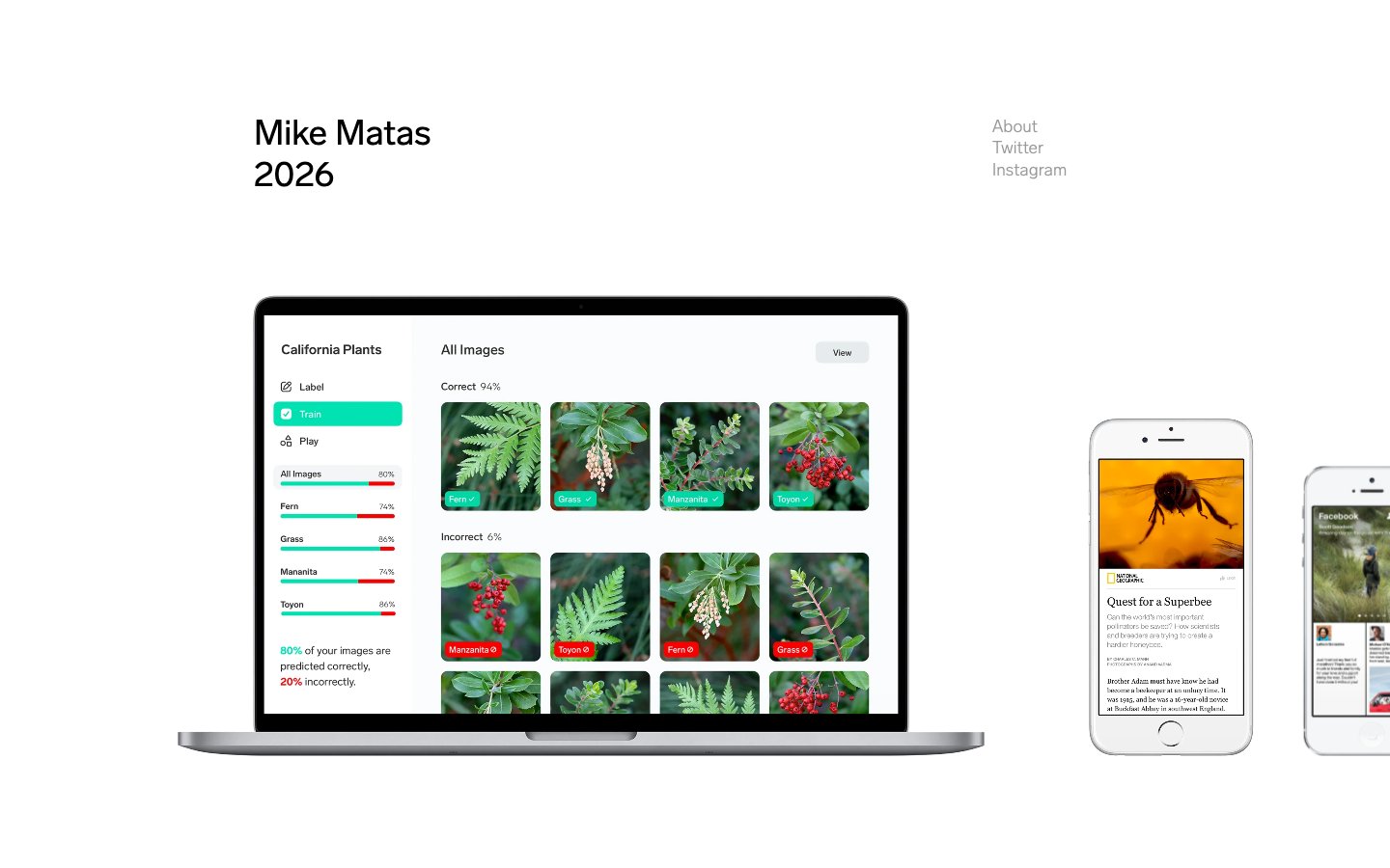
Minimalist textual canvas. Information presented with monastic simplicity against an expansive white background.
Colors
Canvas White
#FFFFFF Page backgrounds, overall dominant background. Provides a pristine, high-contrast surface for text.
Ink Black
#000000 Primary text, headings, icons, interactive elements. Represents the core informational content.
Muted Gray
#999999 Secondary text, subtle details, meta-information. Lowers the visual prominence without losing readability.
Do
- Prioritize text as the primary visual element; every textual unit should be considered and precise.
- Maintain a high-contrast ratio between Ink Black (#000000) text and Canvas White background.
- Use Lab Grotesque consistently across all type roles, adhering to specified weights and sizes.
- Employ generous negative space, particularly horizontal and vertical margins (72px, 36px), to create a sense of calm and focus.
- Use a 0px border-radius for all elements, maintaining crisp, sharp edges.
- Confine body and main content to a max-width of 900px, centered on the page.
Don't
- Avoid decorative elements, borders, or background colors that detract from body copy or visual clarity.
- Do not introduce additional typefaces or weights beyond Lab Grotesque 100, 400, 600.
- Refrain from using shadows or gradients; depth is achieved primarily through spacing and content hierarchy.
- Do not use color for emphasis; use changes in type size, weight, or the Muted Gray (#999999) secondary color.
- Avoid unnecessary icons or imagery that don't directly convey essential information.
- Do not break the strict achromatic palette with any brand or accent colors on the main content page.