PUBLIC REFERENCE
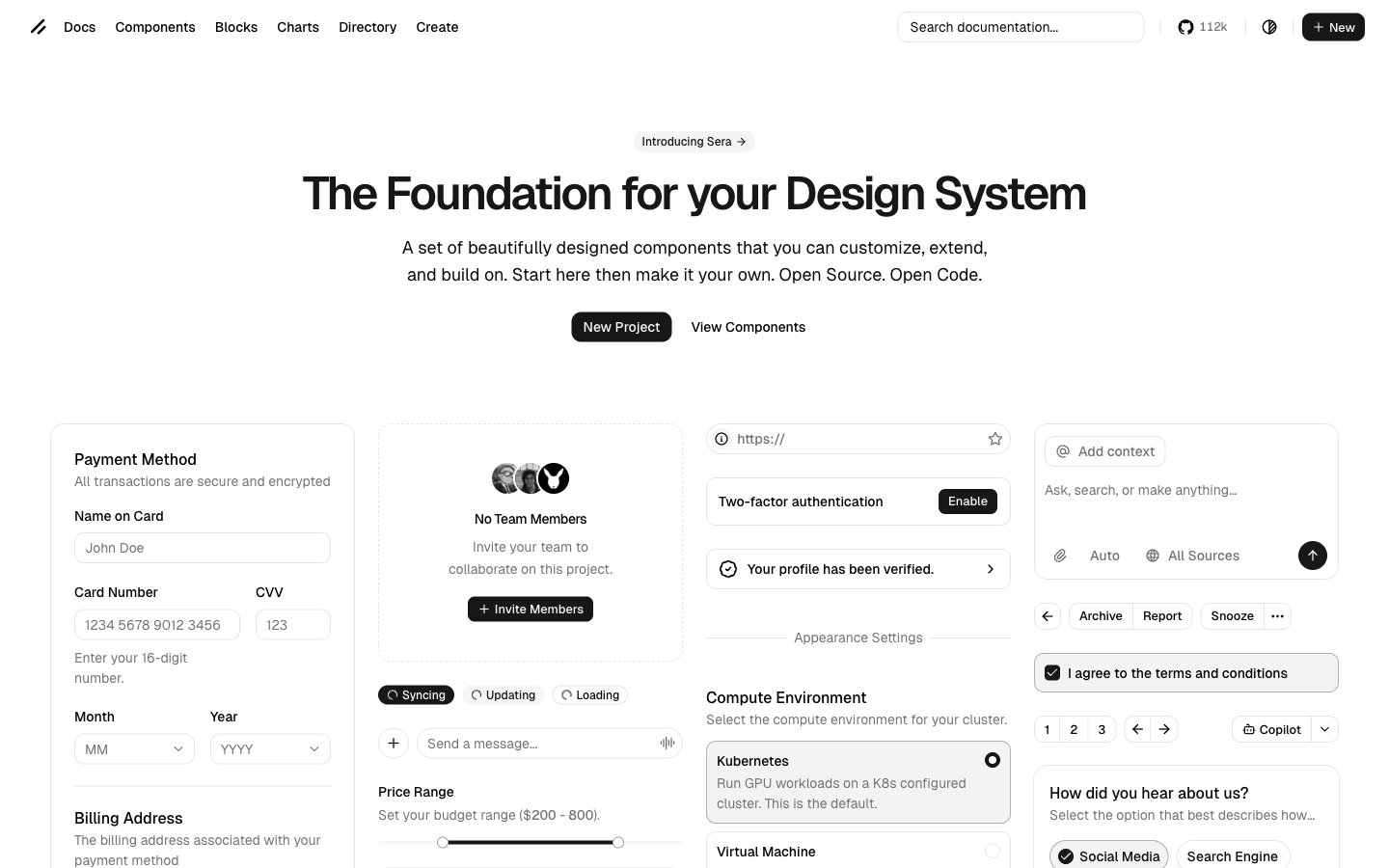
Ui
Monochromatic architectural blueprint – precise, functional forms on a stark, bright canvas.
Colors
#ffffff Page background, primary card surfaces, popovers. The foundational bright base.
#f2f2f2 Secondary background for segmented sections or subtle card differentiation. Lighter than default background.
#e5e5e5 Border colors for inputs, cards, and dividers. Provides definition without harshness.
#737373 Muted text, placeholder text in inputs, secondary icons. Recedes into the background.
#0a0a0a Primary text color for body copy, standard icons, badges with white text. High contrast for readability.
#000000 Headings, active state button backgrounds, highlighted text. The darkest tone for strong emphasis.
#c22b10 Destructive actions, error states. A muted, serious red.
#10c22b Success states, positive confirmations. A muted, serious green.
Do
- Use Deep Black (#000000) for primary headings and active states to command attention.
- Apply Subtle Ash (#e5e5e5) for all primary borders and dividers to maintain a subtle visual separation.
- Ensure input fields and cards consistently use a 10px or 14px border-radius, respectively, for geometric stability.
- Employ Geist font universally, leveraging its 400, 500, and 600 weights to establish clear hierarchy without introducing new typefaces.
- Maintain a default element gap of 8px, but use 16px for card inner padding to create adequate breathing room for content.
- Utilize 9999px or 26px border-radius for all interactive buttons and badges to create a soft, approachable pill shape.
Don't
- Avoid using highly saturated colors; stick to the achromatic scale and the two semantic reds and greens.
- Do not introduce additional font families; the current choices are sufficient for all typographic needs.
- Refrain from using strong, multi-directional shadows; rely on minimal 1px shadows or simple borders for elevation.
- Do not deviate from the established border-radius values; the mix of sharp 0px (in split elements), 10px, 14px, and 9999px is intentional.
- Don't add excessive padding or margin; the design favors a compact density with specific, calculated spacing.
- Avoid decorative gradients; the brand's aesthetic is built on flat colors and subtle depth.