PUBLIC REFERENCE
Intercom
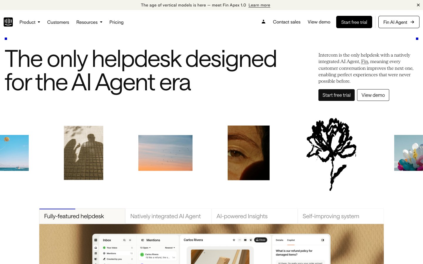
Architectural blueprint on white marble
Colors
#ffffff Page backgrounds, primary surfaces, overlay base.
#faf9f6 Subtle background for sections or softer UI elements.
#f1eee9 Slightly elevated surface, subtle background differentiation.
#dedbd6 Delicate borders for subtle UI separation, active tab indicators.
#e7e3db More pronounced background for distinct content blocks, light dividers.
#d3cec6 Background for secondary content areas or muted sections.
#111111 Primary heading text, strong impactful body copy.
#000000 General body text, links, primary UI elements, icons.
#414141 Muted text for less prominent information, secondary links.
#585858 Secondary text, descriptive elements with slightly less emphasis than body text.
#666666 Tertiary text, footer links, less critical information.
#707070 Icons and very subtle UI elements.
#888888 Text for secondary buttons, disabled states.
#a0a0a0 Placeholder text in input fields, further muted text elements.
#b8b8b8 Icons in inactive or secondary states.
#0007cb Primary interactive elements, call-to-action buttons, active indicators — a vivid modern accent against the neutral palette.
#ff5600 Highlighting specific words or small interactive elements, used sparingly for emphasis.
Do
- Use Headline Black (#111111) for all major headings and impactful statements to maintain strong contrast.
- Apply Saans font with a weight of 300 for display-sized headlines (54px, 80px) to achieve an authoritative yet understated feel.
- Implement 4px border-radius for all interactive buttons and navigation items, creating a subtle visual softness.
- Reserve Accent Violet (#0007cb) strictly for primary interactive elements, such as CTA buttons and active state indicators.
- Differentiate sections using the neutral background progression: Canvas White (#ffffff) > Background Off-White (#faf9f6) > Surface Cream (#f1eee9) for subtle visual hierarchy.
- Maintain standard element spacing of 16px for comfortable content flow, adjusting vertically with multiples of 8px as needed.
- Utilize SaansMono for any technical or explicit code-like content, with its distinctive increased letter-spacing.
Don't
- Avoid using saturated colors other than Accent Violet (#0007cb) and Accent Orange (#ff5600) to preserve the clean, neutral aesthetic.
- Do not introduce sharp, unrounded corners on interactive elements, as this contradicts the established 4px radius pattern.
- Refrain from heavy drop shadows or complex gradients; the system relies on subtle background shifts and crisp lines for depth.
- Do not deviate from the specified Saans, SaansMono, or MediumLL typefaces; ensure consistency in typographic personality.
- Avoid dense, information-heavy blocks without adequate spacing; prioritize comfortable content density and readability.
- Do not use Body Text Black (#000000) for large, prominent headlines; Headline Black (#111111) should be preferred for impact.
- Do not use highly saturated photography; imagery should align with the muted or monochromatic style.