PUBLIC REFERENCE
14islands
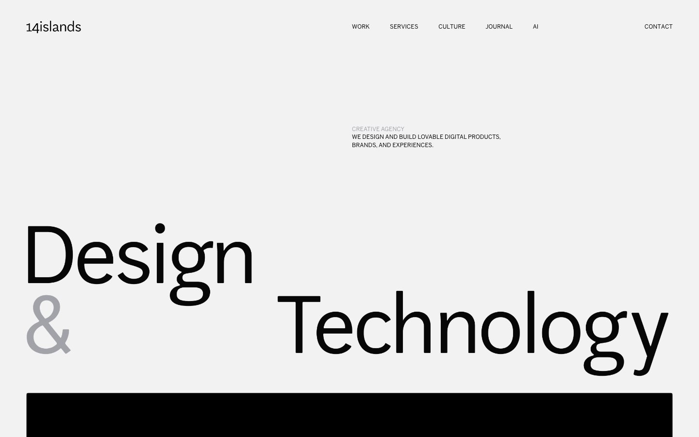
Editorial Minimal Canvas — Large, impactful typography commands attention against vast, light-gray expanses.
Colors
Canvas White
#f2f2f2 Primary page background, neutral surfaces. Provides a clean, bright stage for content.
Deep Graphite
#070707 Primary text, headings, icons, actionable element borders. Serves as the dominant dark element for strong contrast.
Off White
#ffffff Used sparingly for specific background elements within content areas. Acts as a subtle variation to Canvas White.
Soft Gray Highlight
#a2a2a9 Secondary text, subtle borders, inactive states, and highlights. Offers a toned-down visual alternative to Deep Graphite.
Medium Gray Highlight
#797979 Tertiary text, less prominent information. Provides a slightly darker, more readable alternative to Soft Gray Highlight for smaller text.
Do
- Prioritize `Canvas White` (`#f2f2f2`) as the main background for content areas and `Deep Graphite` (`#070707`) for all primary text, ensuring visual clarity and impact.
- Use `AftenScreen` at its largest sizes (75px, 100px, 180px) with negative letter-spacing for all hero and section headlines to create dramatic visual tension.
- Employ `BentonSans` at 16px weight 400 with a 1.4 line height for all body copy and secondary informational text to maintain high readability.
- Introduce `Soft Gray Highlight` (`#a2a2a9`) for secondary text elements or visual accents, especially for subheadings or subtle distinctions.
- Apply a consistent `4.16667px` border-radius to all image containers and interactive elements, avoiding sharp corners while still maintaining a structured feel.
- Maintain generous vertical spacing between sections, using values around `100px` to `108px` to ensure content breathes.
- Ensure interactive elements (buttons, links) are either `Deep Graphite` (`#070707`) or `Soft Gray Highlight` (`#a2a2a9`) with no background, relying on text and subtle borders for indication.
Don't
- Avoid using background colors other than `Canvas White` (`#f2f2f2`) or `Off White` (`#ffffff`) for primary content sections.
- Do not introduce highly saturated or vivid chromatic colors; adhere strictly to the established neutral palette.
- Refrain from using strong box-shadows or complex elevation effects; the design relies on spacing and typography for hierarchy.
- Do not deviate from the specified negative letter-spacing for `AftenScreen` headlines, as this is a core part of its visual identity.
- Avoid pill-shaped or overly rounded elements; the standard `4.16667px` radius should be used consistently.
- Do not use generic system fonts; always specify `BentonSans` or `AftenScreen` (or their approved substitutes) for all text.
- Do not add additional padding or background styles to the 'Minimal Button' components; their design is intentionally understated.