PUBLIC REFERENCE
Sequel
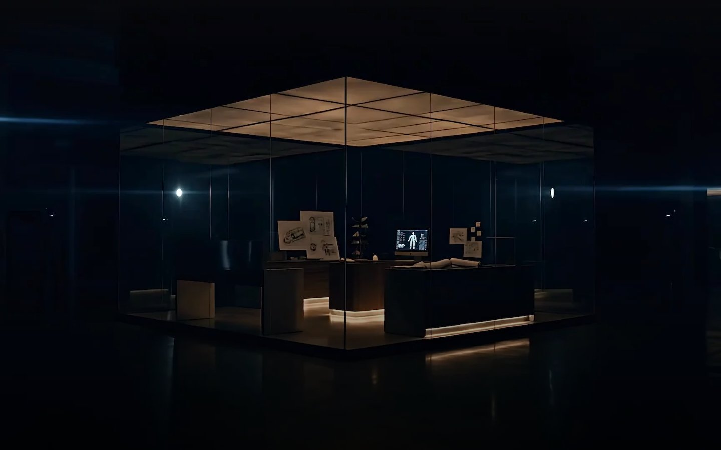
Black canvas, sharp typography
Colors
#000000 Page backgrounds, primary dark surfaces, text on light elements.
#ffffff Primary text, critical UI elements, borders for ghost buttons — creating stark contrast against dark backgrounds.
#f5f5f0 Primary background for solid buttons, providing a subtle off-white alternative to pure white for interactive elements.
#202020 Secondary background for containers, slightly differentiated from the deepest black.
#c0c0c0 Subtle text, less prominent borders, and icons.
#333333 Badge backgrounds when slightly darker contrast is needed, secondary borders.
#999999 Tertiary text, descriptive labels, less emphasized information.
#cccccc Fine print, less important body copy. Similar to Ash Accent but slightly lighter.
#b3b3b3 Placeholder text or disabled states, providing a further step down in visual hierarchy.
#333333 Background for transparent badges, providing a muted dark tint.
Do
- Prioritize #000000 for backgrounds and #ffffff for primary text to maintain high contrast and dramatic impact.
- Use Bradford font exclusively for large headings (32px and above) with its distinct weight 500 and negative letter spacing (-0.0500em or -0.0250em).
- Apply 9999px border-radius to all interactive elements like buttons and badges for distinctive pill shapes.
- Utilize rgba(200, 200, 200, 0.1) for subtle, transparent badge backgrounds, ensuring text remains #ffffff.
- Maintain a clear visual hierarchy using VisueltPro's varied weights and sizes for body copy, navigation, and secondary UI elements, without relying on color for differentiation.
- Employ the negative letter-spacing values from the typography specification for precise text rendering at various sizes.
- Use 10px border-radius only for specific featured cards to provide a subtle visual differentiator against the predominant 0px radius.
Don't
- Avoid using highly saturated or chromatic colors; stick to the achromatic palette with #ffffff, #000000, and the various grays.
- Do not introduce sharp corners on buttons or badges; the 9999px radius is a signature visual element.
- Refrain from using Bradford font for body text or small UI elements; its use is reserved for large, impactful headlines.
- Do not add additional box-shadows beyond rgba(0, 0, 0, 0.35) 0px 10px 30px 0px for elevated elements and rgba(0, 0, 0, 0.15) 0px 4px 20px 0px for interactive button states.
- Avoid using multiple border styles or weights; maintain simple, thin borders for ghost elements or an absence of borders.
- Do not use generic system fonts in place of VisueltPro or Bradford; their unique characteristics are integral to the brand.
- Avoid excessive spacing that diminishes the dense, deliberate feel; element gaps should adhere to the provided '3-28px' range.