PUBLIC REFERENCE
New Genre
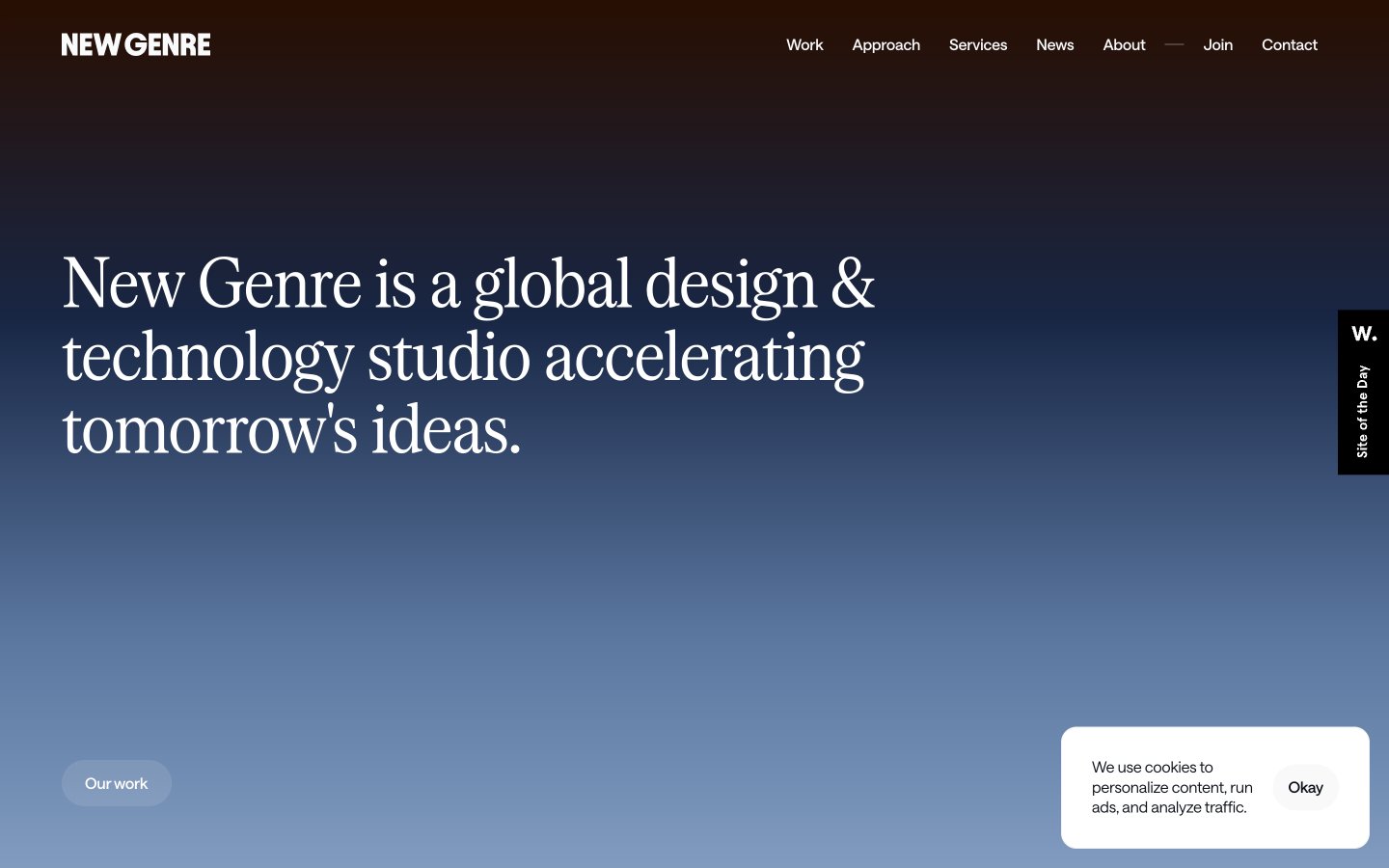
Shifting Gradual Horizon — a continuous, subtle color transition across surfaces, like watching a sunrise or sunset unfold.
Colors
#000000 Primary text, headers, prominent UI elements, icon fill — anchors the gradients with stark contrast.
#ffffff Background for clean content sections, inverse text on dark backgrounds, active elements in navigation — creates clear content islands on the gradient canvas.
#1e1310 Darkest background for footer sections — grounds the site with a rich, almost black earth tone.
#0c1018 Main body text, input fields, prominent text — a very dark gray that provides high contrast without being pure black.
#9e9fa3 Subtle secondary text, border elements, placeholder text — used for less prominent information, allowing primary content to stand out.
#6d7074 Desaturated gray for some headings — provides a softer emphasis compared to Ebon Depth.
#280e01 Primary page background, hero section — shifts from deep, burnt umber through cool blues to soft, pale gold, creating a dynamic, subtle backdrop that feels vast and atmospheric.
#ffe600 Subtle accent for ephemeral elements, often with transparency — its soft luminosity is a counterpoint to the primary gradient.
#f7f3f0 Decorative background gradient used for visual breaks — transitions from transparent through fiery oranges and reds to a deep, earthy brown, adding warmth and energy.
#1e1310 Rich, warm gradient for sections requiring strong visual presence — deep browns and oranges signifying grounding and energy.
Do
- Prioritize the Sky Gradient as the primary background for full-page or hero segments to establish the atmospheric and shifting visual identity.
- Use Serrif Condensed Regular with -0.02em letter-spacing for all significant headlines to emphasize precision and a slightly formal tone.
- Maintain a clear hierarchy with Ebon Depth #000000 or Onyx Shadow #0c1018 for primary text and Mist Gray #9e9fa3 for secondary information.
- Apply 90px border-radius for all primary action buttons ('pill buttons') and 50px radius for input fields, establishing a soft, approachable interaction style.
- Ensure consistent horizontal padding of 24px for all major content blocks and card elements to maintain a structured, spacious feel.
- Leverage the Saans Variable font family for all body, subheading, and UI text, ensuring its specific negative letter-spacing for a tight, refined look.
Don't
- Avoid harsh, solid background colors; instead, opt for gradients or Whisper White #ffffff to preserve the site's ethereal quality.
- Do not use overly bold or heavy font weights; the system relies on lighter weights like Saans Variable 300-500 and Serrif Condensed Regular 400.
- Refrain from using strong, single-color accents; instead, any accent should be subtle, transparent, or part of a larger gradient.
- Do not introduce sharp corners or small radii on interactive elements; all buttons and inputs should adhere to 50px or 90px border-radius.
- Avoid dense, information-heavy sections without adequate section gaps (48-52px) or element gaps (6-24px); maintain a compact yet breathable layout.
- Do not use default browser link styling; ensure all links use Saans Variable and are styled consistently with the navigation links or body text.