PUBLIC REFERENCE
Bang & Olufsen
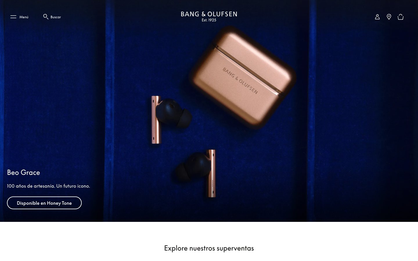
Gallery of precise objects. A dark, velvet-lined showcase where each product rests, spotlighted with refined exactitude.
Colors
#060daa Footer background, primary accent for deep sections – creating a luxurious, immersive foundation.
#191817 Dominant text color for headings and body content on light backgrounds, input borders – provides stark contrast and grounded presence.
#fcfaee Primary text color on dark backgrounds, selected button text – a creamy off-white that softens the high contrast.
#555555 Secondary text, subtle link color – offers a muted informational tone against white.
#ffffff Page backgrounds, card backgrounds, input backgrounds – provides clean, expansive canvas.
#e5e5e5 Subtle border colors for inputs – an almost imperceptible divider.
#000000 Primary icon color, borders on ghost buttons – a hard, crisp edge or fill.
Do
- Prioritize the custom 'BeoSupreme' font for all textual content, leveraging its unique character and precise letter-spacing.
- Use 'Midnight Indigo' (#060daa) exclusively for foundational elements like the footer to establish a luxurious, deep anchor.
- Maintain a clear visual hierarchy by contrasting 'Carbon Black' (#191817) text on light backgrounds (#ffffff, #fcfaee) and 'Barely White' (#fcfaee) on dark backgrounds (#060daa).
- Employ the 40px border-radius strictly for primary CTA buttons, ensuring they stand out as the sole 'soft' element.
- Utilize generous negative space around product imagery and text blocks to convey a sense of premium quality and focus, with section gaps around 48px.
- Ensure all interactive elements, especially primary CTAs, meet a minimum contrast ratio of 4.5:1 against their background.
- Use a subtle 1px border for ghost button states and text links to provide definition without visual weight.
Don't
- Do not introduce additional font families; 'BeoSupreme' defines the typographic identity.
- Avoid using multiple accent colors; 'Midnight Indigo' is reserved for specific, prominent sectional backgrounds.
- Do not deviate from the established border-radius values (0px, 2px, 40px); rounded corners are intentional and scarce.
- Do not use box-shadows; elevation is handled through background color changes and spatial separation.
- Avoid decorative elements or busy backgrounds; the aesthetic emphasizes product clarity and clean UI.
- Do not create dense content blocks; the comfortable density principle with a 4px base unit should be consistently applied.
- Never use the browser default blue for links; control all link colors with 'Carbon Black', 'Ash Gray', or 'Barely White'.