PUBLIC REFERENCE
Midday
Achromatic ledger, crisp yet silent
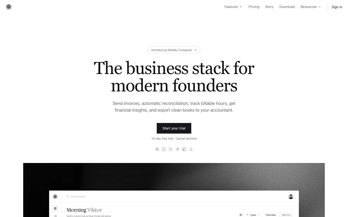
Colors
#ffffff Page backgrounds, card surfaces, ghost button backgrounds, default icon fill — creates a bright, expansive foundation
#121212 Secondary body text, navigation labels, and subdued headings. Do not promote it to the primary CTA color
#dbdad7 Hairline borders for cards, buttons, and decorative separators — defines structure without visual weight, echoing traditional ledger paper
#18181b Primary action button background — provides a strong, serious focal point for key interactions against the light canvas
#e6e4e0 Subtle background for secondary sections, selected tabs, and subtle hints of elevation — adds textural variation within the neutral palette
#616161 Secondary text, link text, helper text, and subtle icon strokes — provides hierarchy and de-emphasizes content gently
#4caf50 Green text accent for links, tags, and emphasized short phrases. Use as a supporting accent, not as a status color
Do
- Use Hedvig Letters Sans at weight 400 for all body text and UI elements, with Ink Black (#121212) as the default text color.
- Apply Hedvig Letters Serif at weight 400 and letter-spacing -0.0250em for main headings and display text, using Ink Black (#121212).
- Define all structural boundaries with a 1px solid Ash Gray (#dbdad7) border to maintain a lightweight, precise aesthetic.
- Utilize Canvas White (#ffffff) as the dominant background for all primary content surfaces and page canvas.
- Form primary action buttons with a solid Deep Graphite (#18181b) background and Canvas White (#ffffff) text, always with a 0px border-radius.
- Ensure all interactive elements and badges with a soft, secondary role use a 9999px radii, contrasting with the sharp corners of content cards.
- Maintain a clear visual hierarchy by applying Muted Stone (#616161) for secondary text and helper elements.
Don't
- Avoid using box-shadows; visible elevation is created through subtle background color changes or strong typographic hierarchy instead.
- Do not introduce additional chromatic colors beyond Success Green (#4caf50), reserving it exclusively for semantic indicators and data accents.
- Never use rounded corners on content cards or panels; maintain the sharp, square aesthetic (0px radius) for all informational containers.
- Do not vary line-height unless explicitly defined by the type scale; follow the specified line-heights for each font size to maintain vertical rhythm.
- Avoid using bold weights for body text; rely on color contrast and spacing for emphasis within paragraphs.
- Do not use gradients for backgrounds or components; the system relies on flat colors and subtle textural variation.
- Refrain from using decorative imagery or full-bleed photography that breaks the clean, high-key achromatic canvas.