PUBLIC REFERENCE
Delphi
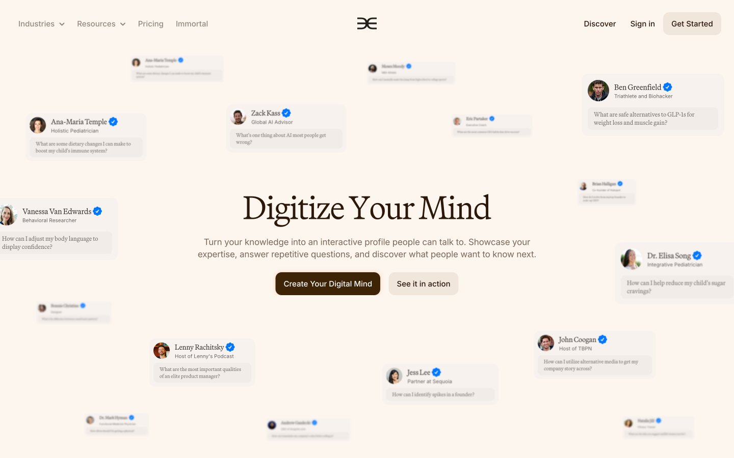
Cognac-Stained Parchment – A sense of aged wisdom and quiet authority, inviting deep contemplation.
Colors
#fdf6ee Primary page and card backgrounds, lending a warm, analog feel to the digital interface.
#2b180a Primary text color for body copy, headings, and key UI elements, offering strong contrast against the warm backgrounds.
#94877c Secondary text, subtle borders, and placeholder text, providing visual hierarchy without harshness.
#7f6e60 Tertiary text and subtle accents, deepening the warm neutral palette.
#3e2407 Interactive elements like primary buttons and emphasized text, acting as a warm, grounded accent.
#a99d93 Subtle borders and muted instructional text.
#f0e6dc Hover states and secondary button backgrounds, a slightly darker shade of the primary background for subtle interaction feedback.
#f65726 Used sparingly for dynamic highlights or notification states, providing a vibrant pop.
#ff5c00 Occasional accent for specific headline emphasis, drawing attention without being overwhelming.
#ffffff Text on dark backgrounds, or pure white elements for contrast against Parchment White.
#21201c Deep, almost black text for strong contrast where needed.
Do
- Use Martina Plantijn Light at weight 300 for all content headings larger than 24px, applying appropriate negative letter-spacing.
- Maintain #fdf6ee as the primary background color for all main page content and interactive cards.
- Apply a default border-radius of 12px to all interactive elements and contained content blocks like cards.
- Employ the Deep Cognac (#2b180a) as the default text color for primary content and navigation.
- Utilize Inter at 15px with line height 1.4 for most body copy, ensuring an open and readable text block.
- Emphasize primary calls-to-action using a filled button with Burnt Umber (#3e2407) background and white text.
- Ensure consistent spacing elements are multiples of 4px, especially for padding within components and between text blocks.
Don't
- Do not use highly saturated colors for backgrounds or large text areas; reserve them for small, impactful accents like #f65726 or #ff5c00.
- Avoid harsh shadows; prefer subtle, barely-there elevations to maintain the soft, warm aesthetic.
- Do not use pure black (#000000) for text on #fdf6ee backgrounds unless for specific, high-contrast, legal text. Prefer Deep Cognac (#2b180a) or Dark Charcoal (#21201c).
- Do not break the established type scale; Martina Plantijn Light scales with specific letter-spacing adjustments at larger sizes.
- Do not introduce strong, geometric shapes where rounded corners (12px or 70px) are the established pattern.
- Avoid busy or distracting imagery; prefer tightly cropped portraits or clean UI mockups.
- Do not use `sans-serif` (system font) for any primary content; it is reserved for inaccessible or fallback instances.