PUBLIC REFERENCE
Sana Agents
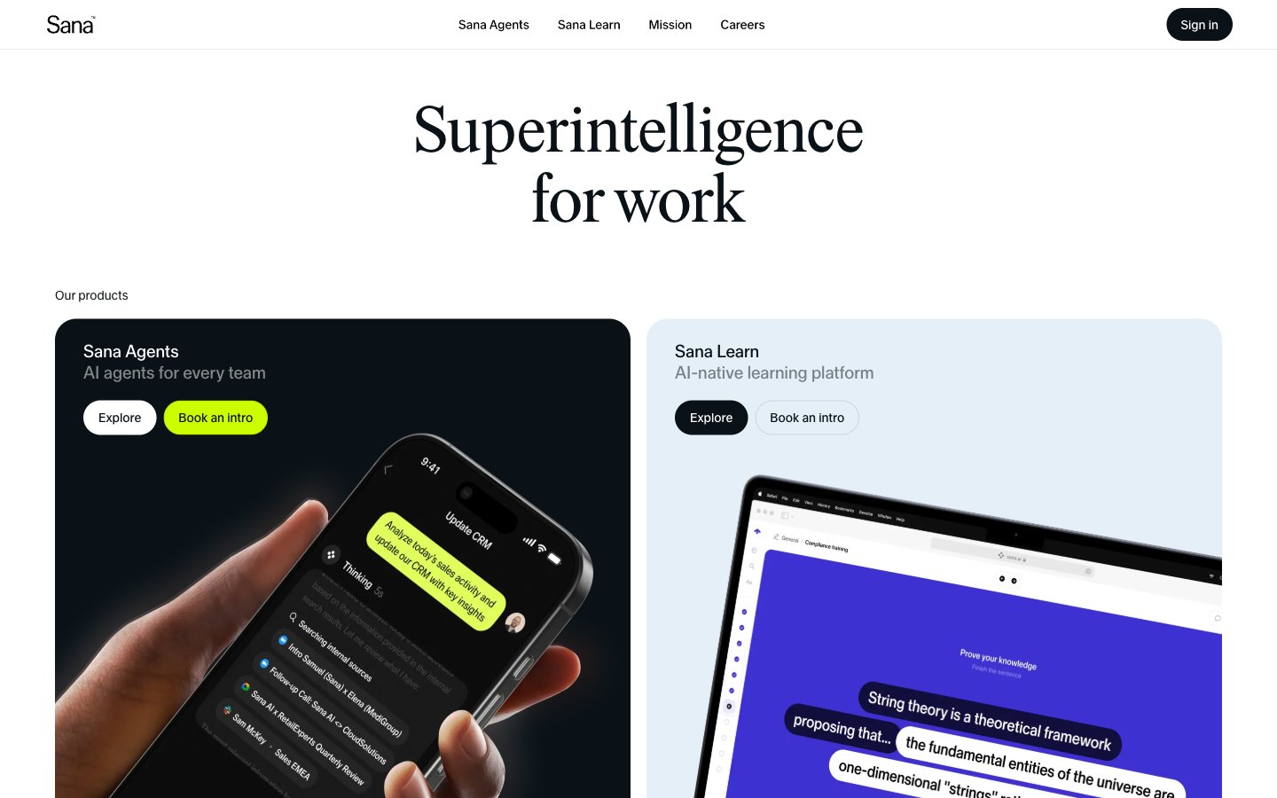
Architectural blueprint on white marble. Sharp, expansive white spaces frame meticulously placed elements, with occasional flashes of neon green illuminating key interactions.
Colors
#0a1217 Primary text, dark backgrounds for feature cards, active states. This near-black serves as the dominant dark tone contrasting against the pervasive white background.
#ffffff Page backgrounds, card surfaces, primary button backgrounds. Expansive and dominant, it provides a sense of spaciousness and clarity.
#e4eff7 Subtle background for secondary sections or hover states on light elements, offering a minimal visual lift from Canvas White.
#000000 Secondary text, specific interactive elements like input text. Used sparingly to ensure maximum contrast and legibility.
#85898b Muted body text and secondary information, providing a softer contrast than Tarmac.
#6c7174 Subtle text elements, navigational links, and less prominent headings, maintaining readability without overpowering.
#cdfe00 Primary call-to-action buttons, indicating action and drawing immediate attention with its vivid contrast against the neutral palette.
Do
- Use Sana Serif for display headlines at 72px, weight 400, to establish authority.
- Apply Tarmac (#0a1217) for primary text and dark surface backgrounds to maintain strong contrast.
- Utilize Bio-Luminescent Green (#cdfe00) exclusively for primary call-to-action buttons, drawing clear attention.
- Employ 24px border-radius for all primary buttons and input fields to ensure a consistent contemporary feel.
- Maintain a clear page structure with 62px vertical spacing between major sections.
- Use Sana Sans (lnum, tnum) across all body text, navigation, and interactive elements for numeral consistency and legibility.
- Ensure all interactive elements have sufficient padding: 8px 16px for buttons, 8px 18px for inputs.
Don't
- Do not use highly saturated colors other than Bio-Luminescent Green (#cdfe00); the palette is intentionally restrained.
- Avoid decorative shadows or complex gradients; the aesthetic is flat and crisp.
- Do not introduce additional font families; Sana Serif and Sana Sans are the only approved typefaces.
- Do not deviate from the established border radii; 24px and 9999px are the only sanctioned options for interactive elements.
- Do not vary paragraph line-height aggressively; keep it within the 1.2-1.5 range to maintain reading comfort.
- Avoid using Jet Black (#000000) for large blocks of text; reserve it for specific accents or input fields.
- Do not use small padding values; minimum 8px padding ensures adequate tap targets and visual breathing room.