PUBLIC REFERENCE
Rox
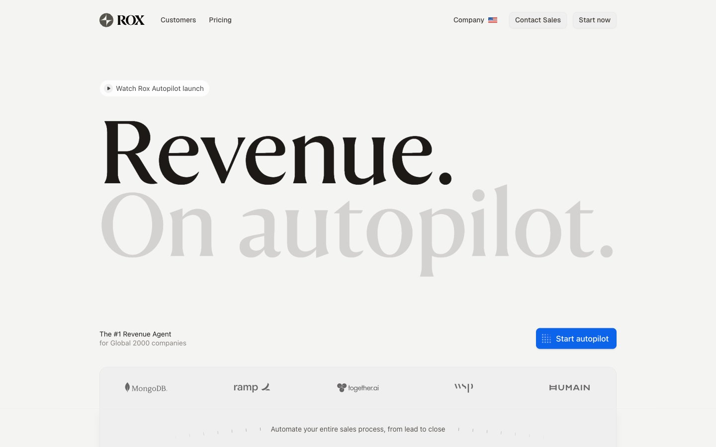
Analytical Blueprint on Pure White. An interface that feels like a meticulously charted course on a pristine, well-lit canvas.
Colors
#f5f5f4 Primary background for pages and major sections, providing a clean, bright foundation.
#ffffff Used for cards, panels, and elements needing to stand out slightly from the main background, often appearing as content containers.
#0b64e9 Primary brand accent, used for all calls-to-action, interactive states, and key navigational elements to draw attention without being overwhelming.
#0c0a09 Main body text, headlines, and critical information for maximum readability against light backgrounds.
#1c1917 Subheadings, supporting text, and less emphasized information, a subtle step lighter than primary text but still high contrast.
#a6a09b Placeholder text, minor labels, and supplementary details, providing a softer visual presence.
#57534d Less prominent text like captions or descriptions, visually receding while remaining legible.
#ececea Backgrounds for subtle containers like badges or minor card elements, offering a hint of differentiation.
#f0efef Distinguishes UI elements with a subtle border, especially for form fields and interactive elements.
#d4d2d1 Used for disabled states of interactive components, indicating non-interactability.
#f24149 Indicator for errors or important alerts, drawing quick attention.
#f97006 Highlighting warnings or moderate priority information.
#f9b703 For informational highlights or less critical status indicators.
#6b4aff Likely for specific status tags or categories, providing visual distinction.
Do
- Use 'FH Total Display Regular' solely for hero-level headlines (106px, 183px) to establish brand gravitas; reserve serif usage for maximum impact.
- Apply 'Blueprint Blue' (#0b64e9) exclusively for primary calls-to-action and active states to maintain clear visual hierarchy.
- Employ the '#f5f5f4' 'Page Canvas' for all primary page backgrounds to ensure an expansive, clean aesthetic.
- Utilize Geist font with a -0.02em letter-spacing for all body text and subheadings to maintain the distinct digital typography.
- Standardize on 6px default radii for all general elements and 8px for buttons, except for pill shapes which use 100px.
- Always use 'Text Primary' (#0c0a09) for main body copy and 'Text Secondary' (#1c1917) for sub-content on light backgrounds for optimal contrast.
Don't
- Do not use multiple saturated colors for primary interactive elements; Blueprint Blue (#0b64e9) serves as the singular brand identifier.
- Avoid strong, heavy drop shadows; instead, use subtle shadows like rgba(0, 0, 0, 0.06) 0px 2px 4px 0px for minimal elevation.
- Do not use generic system fonts for prominent headings; FH Total Display Regular is reserved for brand distinction.
- Refrain from using color to signify hierarchy on text elements; instead, rely on font weights, sizes, and the specified neutral color scale (Text Primary, Secondary, Muted).
- Do not introduce new border radii beyond 1px, 6px, 8px, 12px, 16px, 20px, 30px, 36px, and 100px to maintain consistent geometric rhythm.