PUBLIC REFERENCE
Vanta
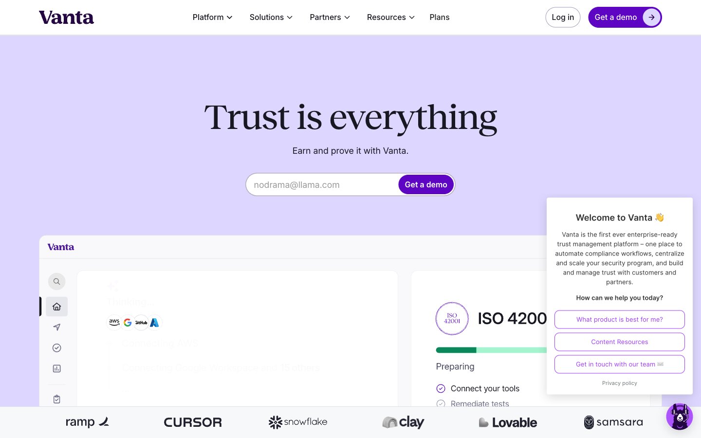
Regal Clarity on White Canvas
Colors
#ffffff Page backgrounds, card surfaces, form inputs, button backgrounds
#f7f8fa Subtle section backgrounds, alternative light surfaces
#eaeaf1 Subtle accents for UI elements, light border accents
#dfdfe9 Functional borders, dividers, subtle outlines
#9e9fb7 Secondary borders, ghost button outlines, disabled states
#6d6e87 Tertiary text, subtle fills, supporting icons
#484960 Secondary text, link text, muted headings
#181822 Primary text, main headings, critical information
#260048 Footer background, secondary brand elements, text on vivid backgrounds
#5e05c4 Primary action buttons, interactive elements, brand accents
#8f47d5 Link colors, badge text, decorative icon accents
#ddd6ff Hero background, soft brand washes
#cdd2f8 Supporting background color, subtle brand elevation
#ffbe0f Warning badges, informational highlights
Do
- Use Midnight Ink (#181822) for all primary body text and main headings to ensure strong contrast and readability.
- Apply Canvas White (#ffffff) as the default background for most content sections and interactive components.
- Utilize Vanta Purple (#5e05c4) exclusively for primary calls to action, such as 'Get a demo' buttons.
- Maintain a 999px border-radius for all interactive elements like buttons and input fields to ensure a consistent friendly, modern feel.
- Establish hierarchy in headings by using Reckless font, applying its smaller letter-spacing values (-0.0180em to -0.0120em) for larger sizes.
- Use Border Fog (#dfdfe9) or Muted Ash (#9e9fb7) for all hairline borders and subtle dividers.
- Prioritize Inter Variable for all functional text, maintaining -0.0020em letter-spacing for consistency.
Don't
- Do not introduce strong shadows; rely on subtle borders or background color shifts for element separation.
- Avoid using highly saturated colors for large background areas; reserve them for accents and interactive elements.
- Do not deviate from the full-rounded (999px) radius for buttons and input fields; this is a signature shape.
- Never use Reckless font for body text or other small functional elements; it is reserved for headlines.
- Do not use generic blue for links or interactive elements; all brand interaction should use Royal Violet (#8f47d5) or Vanta Purple (#5e05c4).
- Avoid dense stacking of information; provide ample white space, leveraging Cloud Gray (#eaeaf1) or Background Snow (#f7f8fa) for breathing room.
- Do not use bright or vibrant photography; imagery should be understated, product-focused, or abstract to allow UI to dominate.