PUBLIC REFERENCE
Fey
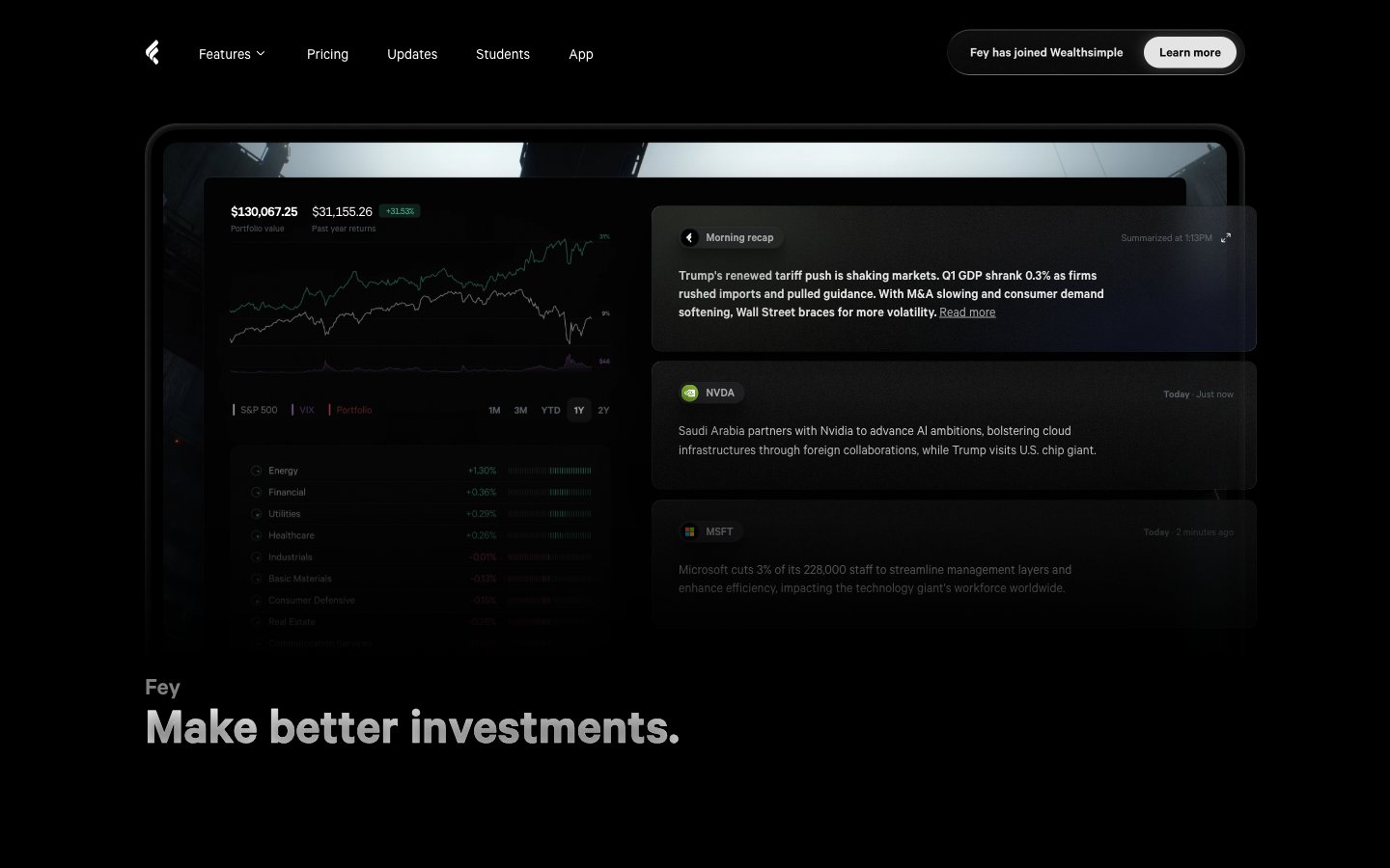
Deep-space observatory control panel. Functionality, precision, and high-contrast data visualization on a near-black canvas.
Colors
#0b0b0b Major surface backgrounds, card bases.
#131313 Elevated card backgrounds, modal backdrops, adding subtle surface differentiation.
#191919 Accent backgrounds, subtle dividers.
#868f97 Secondary body text, disabled states, iconography.
#999999 Tertiary text, subtle descriptions.
#cccccc Subtle interactive elements, subtle outlines.
#e6e6e6 Near-white elements in dark mode, button text for dark buttons.
#ffffff Primary text, prominent iconography, active states, key data readouts.
#479ffa Interactive elements, active navigation items, primary calls to action — signifying state changes and focus.
#ffa16c Prominent headings and highlights, drawing immediate attention to key information without being intrusive.
#4ebe96 Positive data indicators, success states.
#ffa16c Decorative gradient often used for feature highlights.
#b6d6ff Decorative gradient, often paired with data visualizations or abstract elements.
#d6fe51 Decorative gradient, suggesting energy and growth.
Do
- Use Midnight Ink (#0b0b0b) for primary page backgrounds to establish the dark theme.
- Apply Calibre font family with weight 400 for body text and 600 for prominent subheadings.
- Employ Cosmic Blue (#479ffa) exclusively for interactive elements and active states.
- Utilize Solar Flare (#ffa16c) for decorative headings and key value highlights.
- Maintain a clear visual hierarchy by differentiating surfaces with Obsidian Deep (#131313) for elevated elements on Midnight Ink (#0b0b0b) backgrounds.
- Apply 99px border radius for all primary calls-to-action buttons for a distinct pill shape.
- Space elements using multiples of 4px and 8px, reserving larger increments for section gaps (900-1100px) and card padding (18px vertical, 20px horizontal).
Don't
- Do not use chromatic colors other than Cosmic Blue (#479ffa) or Solar Flare (#ffa16c) for branding or interactive elements.
- Avoid using drop shadows on elements that are not meant to signify elevation, like primary page backgrounds.
- Do not use border radii smaller than 6px for interactive elements; for cards and larger containers, use 16px.
- Never lighten text color for emphasis in a dark theme; rely on Pure White (#ffffff) for primary text and Light Smoke (#e6e6e6) or Slate Text (#868f97) for secondary/tertiary.
- Avoid dense information blocks without sufficient elementGap (min 4px, avg 8-20px) to maintain legibility.