PUBLIC REFERENCE
Nothing
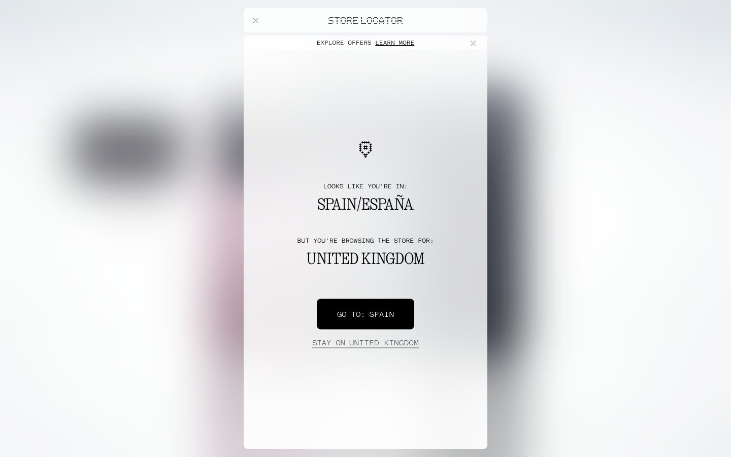
Monochrome digital interface. Pure high contrast black and white with pixelated accents against an almost clinical white canvas.
Colors
Pure White
#ffffff Page backgrounds, elevated surfaces, default icon color.
Cloud Gray
#f5f5f5 Subtle background accents, provides minimal contrast for secondary panels.
Off White
#e5e7eb Divider lines, subtle button borders, a nearly invisible accent against Pure White.
Ash Gray
#979898 Low-contrast primary button background, provides a subtle active state.
Carbon Gray
#585a5a Secondary text, subtle interactive element outlines, provides clear legibility against light backgrounds.
Midnight Black
#000000 Primary text, critical calls to action, dominant interactive elements, creating maximum visual impact.
Vivid Red
#c6102 Low prominence icon highlighting and rare, specific interactive elements.
Do
- Use Midnight Black (#000000) for all primary text and critical headlines, ensuring maximum contrast against light backgrounds.
- Apply NType82-Regular (weights 100, 400) for general text, reserving Ndot-Regular for impactful display headings to maintain the pixelated aesthetic.
- For all interactive elements requiring a default rounded corner, use 8px border-radius.
- Utilize LatteraMonoLL with letter-spacing -0.04em for small, utility text, such as timestamps or meta-information, to enhance the technical feel.
- Maintain high contrast (minimum AAA for text) by pairing Midnight Black text on Pure White or Cloud Gray backgrounds.
- Employ Off White (#e5e7eb) for subtle borders and dividers, providing visual structure without harsh lines.
Don't
- Avoid introducing additional saturated colors; the palette is strictly monochrome with a single accent Vivid Red for specific, subtle functional highlights.
- Do not use letter-spacing on NType82-Regular or Ndot-Regular; their baseline tracking is optimized as-is.
- Do not vary from the established padding values (4px, 8px, 16px, 32px) for interactive elements; they create the system's spatial rhythm.
- Avoid soft shadows or gradients; flat design with stark contrast and minimal elevation is central to the visual identity.
- Do not use standard system fonts. The custom NType82 and Ndot maintain a core part of the brand's unique digital and retro identity.