PUBLIC REFERENCE
Leonardo.ai
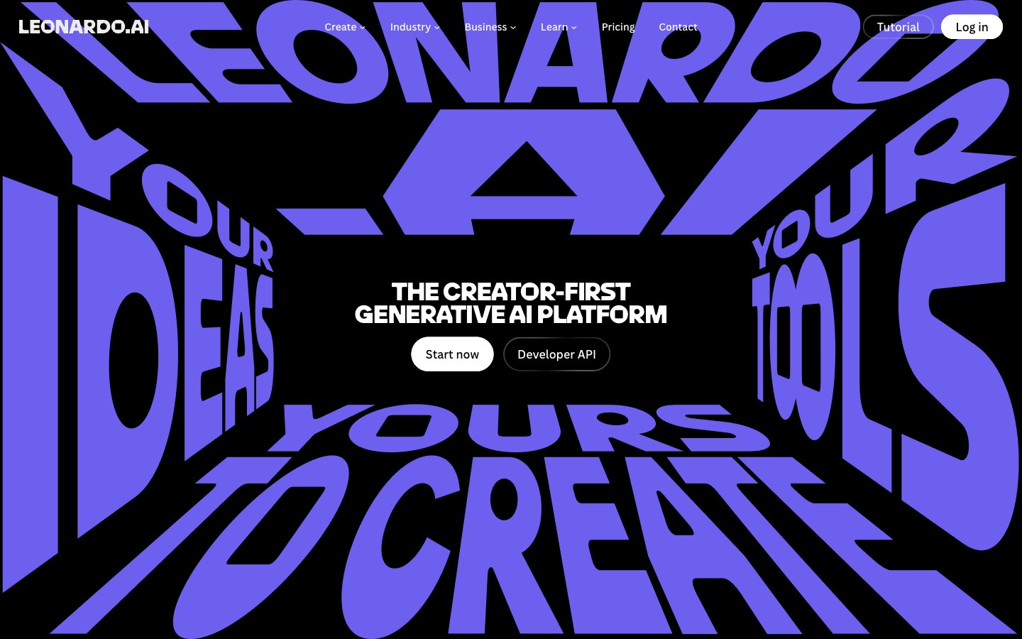
Luminous Digital Void: vibrant hues punching through deep darkness.
Colors
#000000 Primary page background, high-contrast text color on white surfaces, shadow base
#e5e5e5 Subtle borders, dividers, secondary ghost button borders, and input outlines. Provides minimal structural definition without asserting strong presence
#0a0a0a Text on light surfaces, also appearing as link color on dark backgrounds, suggesting a subtle tonal shift from pure black; Background gradient for sections, providing a smooth transition from deep black
#ffffff Primary text color against dark backgrounds, filled button backgrounds, active navigation elements
#353535 Elevated card backgrounds, differentiated from the main background without introducing significant lightness
#999999 Secondary text, descriptive elements, inactive link states. Reduces visual hierarchy
#03e65b Green wash for highlight backgrounds, decorative bands, and soft emphasis behind content
#6e60ee Violet wash for highlight backgrounds, decorative bands, and soft emphasis behind content.
#ffc533 Secondary accent for categorization, highlights, and occasional decorative elements. Creates visual energy
#ff3386 Tertiary accent, often paired with other vivid colors for visual interest or to denote specific categories. Used judiciously
#ff5d4b A warmer red accent, similar in use to Vivid Crimson for visual variety and categorization
Do
- Always use Midnight Void (#000000) for page backgrounds to maintain the deep, dark aesthetic.
- Utilize Pure White (#ffffff) as the primary text color on dark backgrounds for legibility and visual pop.
- Apply LeoSans for all headlines and display text, using extensive letter-spacing adjustments (e.g., -0.0200em for large sizes) to achieve its distinct, compressed look.
- Employ Ghostly Gray (#e5e5e5) for all non-interactive borders, including ghost buttons and dividers, to maintain a subtle structure against dark surfaces.
- Reserve Luminous Green (#03e65b) and Deep Violet (#6e60ee) for distinct accent roles like active states, critical highlights, and brand iconography.
- Use 60px border radius for interactive elements like buttons to achieve a strong pill-like, accessible shape.
- Implement the linear-gradient(rgb(10, 10, 10) 0%, rgba(37, 37, 37, 0.65) 100%) for contained sections that need a softer, slightly varied background from the pure black canvas.
Don't
- Avoid using multiple accent colors in close proximity; instead, let a single accent color make its statement.
- Do not introduce light gray backgrounds for content sections; maintain the dark theme by using Subtle Surface (#353535) for elevated cards.
- Refrain from using default browser link styles; ensure all links use canvaSans and either Pure White (#ffffff) or Muted Ash (#999999) with appropriate hover states.
- Do not use subtle shadows for elevation; the system relies on solid background color shifts for hierarchy.
- Never use `canvaSans` for headlines; its purpose is functional readability, not expressive display.
- Avoid generic rectangular buttons; all prominent buttons should adopt the distinct 60px pill radius.
- Do not introduce large amounts of whitespace around tightly tracked headlines; they are designed to command dense visual space.