PUBLIC REFERENCE
Eco
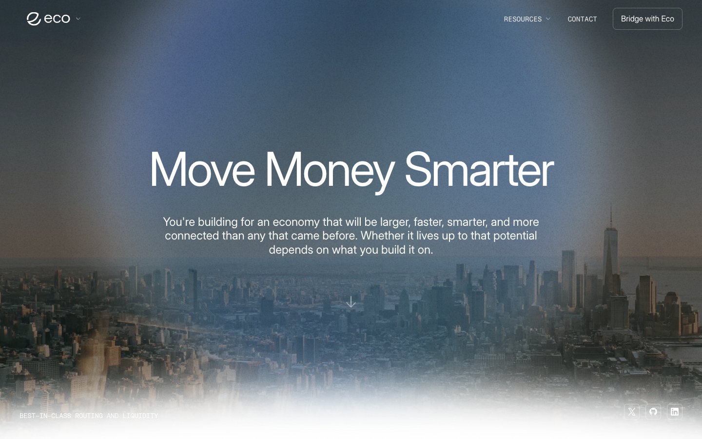
Architectural tech blueprint. Polished surfaces and precise typography overlay an expansive, slightly muted cityscape.
Colors
#ffffff Primary page background, text on dark backgrounds, active states.
#efefef Secondary backgrounds, subtly lifted UI elements, button fills.
#0f111a Primary text on light backgrounds, dark mode backgrounds.
#000000 Deepest dark backgrounds, strong text contrast.
#141414 Subtle background depth in dark sections.
#aeaeae Subtle text emphasis, inactive states, borders in light themes.
#2a2a2a Button backgrounds, dark neutral elements.
#222222 Text on very light backgrounds, subtle borders.
#a0a0a0 Muted headings, secondary text, placeholders.
#1c53bd Highlight elements, interactive indicators, brand-specific imagery – draws attention and signifies modernity.
#a6b8d1 Subtle interactive link color, non-critical emphasis – a soft, cool blue-gray that hints at interaction without aggressive saturation.
Do
- Do use `Roobert` with `96px` size and `-0.0400em` letter spacing for hero headlines to maintain visual impact and precision.
- Do apply `8px` border-radius uniformly to all interactive elements like buttons and input fields.
- Do leverage the `Skybound Gradient` (`linear-gradient(90deg, rgb(28, 83, 189) 71%, rgb(83, 173, 254))`) only for key calls-to-action or distinct visual indicators.
- Do use `48px` as the standard `sectionGap` to ensure consistent vertical rhythm between major content blocks.
- Do prioritize `Midnight Ink (#0f111a)` for text on light backgrounds and `White Smoke (#ffffff)` for text on dark backgrounds for accessibility and brand consistency.
- Do use `Fragmentmono` for all technical code-like text or data displays, ensuring it is `14px` with a `1.00` line-height.
- Do align major content centrally within `pageMaxWidth` when an explicit max-width is later established, or maintain a full-bleed layout as seen in initial hero sections.
Don't
- Don't use `Skybound Gradient` merely for decorative purposes; reserve it for functional or brand-critical highlights.
- Don't introduce additional border-radius values beyond `8px`, `12px`, and `128px` to preserve the established shape vocabulary.
- Don't deviate from the specified tight letter-spacing for `Interdisplay` and `Roobert` at larger sizes; it is a signature trait.
- Don't use highly saturated colors for backgrounds or large areas; maintain the largely achromatic base palette.
- Don't apply `box-shadow` for elevation on cards or containers; the system relies on background color shifts for depth.
- Don't use `Off-White Mist (#efefef)` for primary text, as it's intended for secondary backgrounds and subtle lifts, not high-contrast text.
- Don't introduce new font families; the current selection (Interdisplay, Roobert, Inter, Fragmentmono, Aeonik Mono) is curated for purpose.