PUBLIC REFERENCE
Antimetal
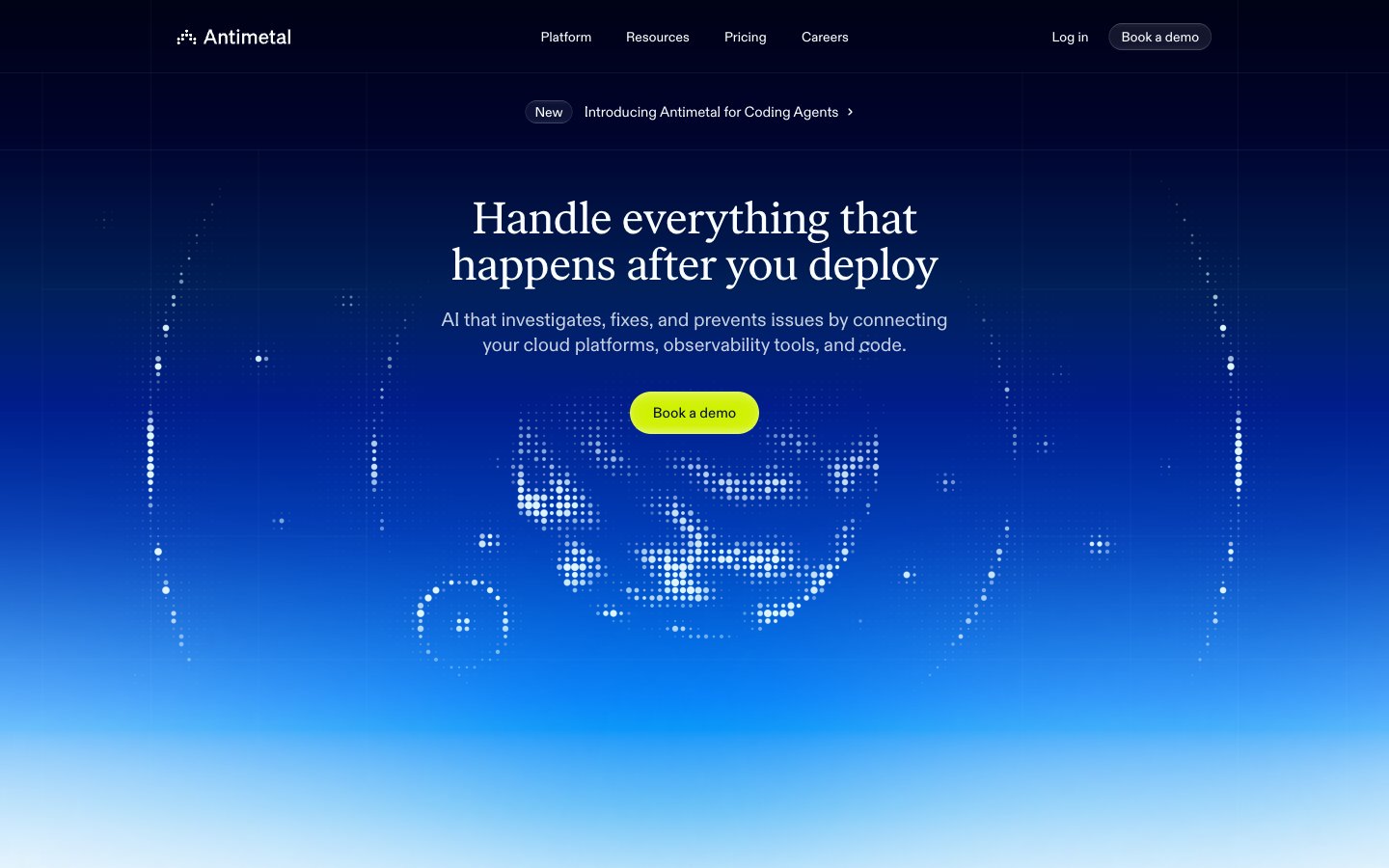
Electric storm over a blueprint — vivid neon signal cutting through deep navy atmosphere, then snapping to precise technical daylight.
Colors
#1b2540 Primary text, heading color on light surfaces, nav text, icon fills, input text, border color across cards and form elements — the structural ink of the entire light-mode UI
#001033 Blue action color for filled buttons, selected navigation states, and focused conversion moments.
#d0f100 Green action color for filled buttons, selected navigation states, and focused conversion moments.
#e0f6ff Ghost button borders in dark hero mode, subtle icon stroke tints, very-light atmospheric surface wash in the hero region
#f8f9fc Primary page background, card fill for feature sections, section backgrounds in the light product UI
#ffffff Elevated card surfaces above the ghost canvas — product UI cards, floating pill badges, modal-level surfaces
#6b7184 Secondary body text, muted labels, icon fills at reduced emphasis
#7c8293 Tertiary text, hairline border fills, subtle strokes on dividers and icon outlines
#596075 Mid-tone text in body copy within darker surface contexts, muted border strokes
#b1b5c0 Hairline borders on buttons and cards in the light theme, icon stroke at minimum visibility
#0050f8 Full-bleed hero background — dark navy at top fading through electric blue to lighter cyan near bottom, creating depth behind the dot-pattern globe illustration
#0080f8 Supporting palette color for small decorative accents when the core palette needs contrast.
Do
- Use 9999px radius on ALL buttons and interactive pill elements — this applies across both dark and light surfaces without exception.
- Reserve #d0f100 exclusively for the primary CTA fill; never use it for decorative elements, icons, or backgrounds other than action buttons.
- Apply blue-tinted shadows using rgba(0,39,80,...) for all card elevation — never use neutral black-based shadows like rgba(0,0,0,...) on light surfaces.
- Use ivarTextFont with font-feature-settings 'ss04','ss06','ss09','ss10','ss11' only at 32px and above; abcdFont handles everything below 32px.
- Maintain the hero-to-light transition as the singular dark section — subsequent sections stay on #f8f9fc with #ffffff elevated cards; do not add additional dark bands.
- Apply letter-spacing -0.016em to -0.005em on abcdFont across all sizes; avoid default browser tracking which makes the type feel unset.
- Use the 1px outer shadow ring (rgba(0,39,80,0.04) 0px 0px 0px 1px) as a border substitute on cards and badges — avoid explicit border-color properties.
Don't
- Don't use #d0f100 in hero sections or dark backgrounds for decorative illustration fills — it appears only as a filled button background.
- Don't apply radius other than 9999px to buttons — even small utility buttons in the product UI use the pill shape.
- Don't mix ivarTextFont into body copy or UI labels below 32px; the serif is strictly a display instrument.
- Don't use more than two surface levels in light sections (#f8f9fc canvas + #ffffff card) — the design system has almost no mid-tone fill colors between these two steps.
- Don't create dark sections beyond the hero; the page's rhythm depends on a single dramatic dark entry followed by sustained light product canvas.
- Don't use black-based text (#000000 or near-black) — all text is #1b2540, even at maximum emphasis, preserving the blue-navy chromatic identity in the type.
- Don't set input borders to rounded — inputs use 0px radius by design, creating deliberate contrast against the pill-heavy button and badge language.