PUBLIC REFERENCE
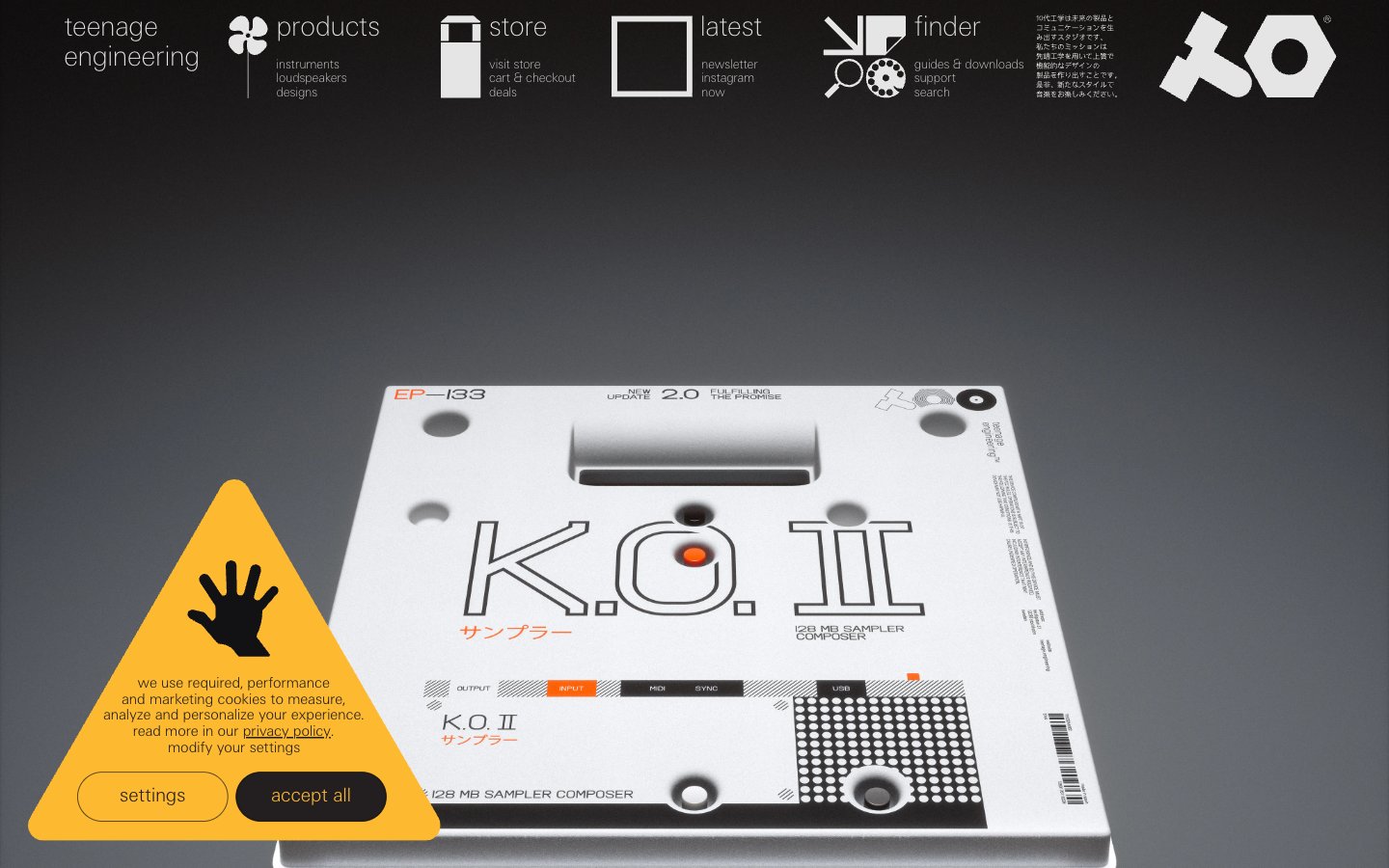
teenage engineering
engineered precision against industrial gray
Colors
Canvas
#f6f8f7 Page background, primary display surface.
Graphite
#0f0e12 Secondary surface, used for darker interactive states or background elements, often paired with lighter text.
Ink
#000000 Primary text color for maximum contrast, borders, and some background elements in high-contrast sections.
Steel
#e5e5e5 Muted text, subtle borders, and sometimes as a background fill for iconography or subtle navigation states.
Smoke
#b2b2b2 Decorative borders around elements, muted text for secondary information.
Electric Blue
#0071bb Interactive elements, 'buy now' links, and accents. Its vividness draws attention to key actions.
Verdant Accent
#006837 Occasionally used for decorative fills, notably in SVG icons, less frequently for UI elements.
Do
- Prioritize the ultra-light 'te-20' and 'te-40' typefaces, especially for headlines, to maintain the brand's understated authority.
- Use Electric Blue (#0071bb) exclusively for interactive elements and calls to action.
- Implement high-contrast pairings of Ink (#000000) text on Canvas (#f6f8f7) backgrounds for primary content.
- Define clear visual hierarchy through font weights (te-40 for main headings, te-20 for body and smaller elements), rather than size alone.
- Maintain generous spacing with 15px for element gaps and 66px for section gaps, contributing to the 'comfortable' density.
- Employ Steel (#e5e5e5) and Smoke (#b2b2b2) for subtle borders and muted text to provide visual structure without heavy lines.
- Leverage the Canvas (#f6f8f7) background as the primary stage, ensuring products and content remain the focal point.
Don't
- Avoid using bold or heavy font weights for headlines; the brand identity is built on a whisper-thin typographic aesthetic.
- Do not introduce new vibrant colors outside of Electric Blue (#0071bb) for interactive elements, as this dilutes the monochromatic focus.
- Refrain from adding decorative shadows or complex embellishments; the design system favors clean, flat surfaces.
- Do not use Electric Blue (#0071bb) for non-interactive text or purely decorative elements, as it's reserved for action.
- Avoid excessive rounding of corners; the design system maintains sharp, precise edge treatments.
- Do not allow text to crowd; ensure ample 15px element spacing and 66px section padding is consistently applied.