PUBLIC REFERENCE
Acctual
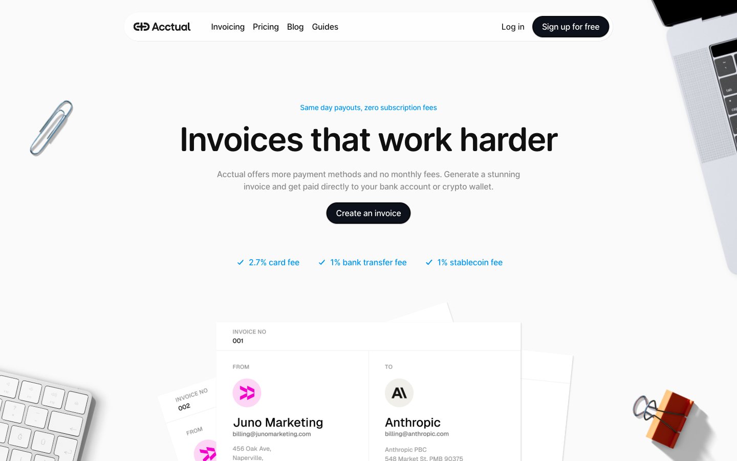
Architectural blueprint on white marble. Precision, clarity, and transparent flow of information.
Colors
#ffffff Page backgrounds, card surfaces, primary text contrast.
#000000 Primary text, critical headings, strong brand emphasis. Its absolute blackness provides uncompromising legibility against white.
#0f0f0f Prominent headings and body text, a slightly softer variant of Ink Black.
#1e1e1 Secondary body text and descriptions, offering a subtle visual break from pure black without sacrificing contrast.
#8d8d8d Subtle text, metadata, disabled states. Provides gentle visual hierarchy.
#0d111b Primary action buttons, providing a solid, grounded feel against the white background.
#0098f2 Interactive elements, links, checkmarks, highlights — the sole vibrant accent for key user actions and positive indications.
#f200ca Decorative elements or specific brand highlights within icons, a secondary accent for visual interest.
#6d56fc Decorative elements or specific brand highlights within icons, alongside Hot Pink.
#f7fafc Alternative background for sections, creating subtle depth on the mostly white page.
Do
- Use '#ffffff' Canvas White as the dominant page and card background color; establish visual hierarchy through subtle shade differences like '#f7fafc' for alternating sections.
- Apply Open Runde for all main headings and body text, varying weights (400, 500, 600) and sizes according to the type scale for clear hierarchy and visual appeal.
- Employ the 100px radius for all interactive buttons and pill-shaped elements to maintain a consistent soft, approachable shape.
- Utilize Sky Teal (#0098f2) exclusively for interactive elements like links and checkmarks; avoid using it for decorative purposes to preserve its accent meaning.
- Maintain generous padding, particularly 24px and 40px for section separators and major element spacing, creating a spacious and comfortable information density.
- When emphasizing short, impactful statements or testimonials, use the Caveat font for a personalized, handwritten touch.
Don't
- Do not introduce new chromatic colors beyond Sky Teal, Hot Pink, and Vivid Violet; the design strictly adheres to an achromatic base with minimal, deliberate color accents.
- Avoid box shadows for general elevation; leverage subtle background color changes (e.g., #f7fafc) or thin borders to suggest depth and separation.
- Do not use system sans-serif for headlines or prominent body text; reserve it for small, functional UI labels where its simplicity is an asset.
- Do not deviate from the established letter-spacing values for Open Runde; these are carefully calibrated for optimal legibility at different sizes.
- Avoid dense, information-heavy sections without adequate whitespace; the design's strength lies in its spacious and clear presentation.
- Do not use multiple font sizes or weights within a single line of text unless it's a clearly defined component. Maintain typographic consistency.