PUBLIC REFERENCE
Fictional
Whimsical Sticker Bomb
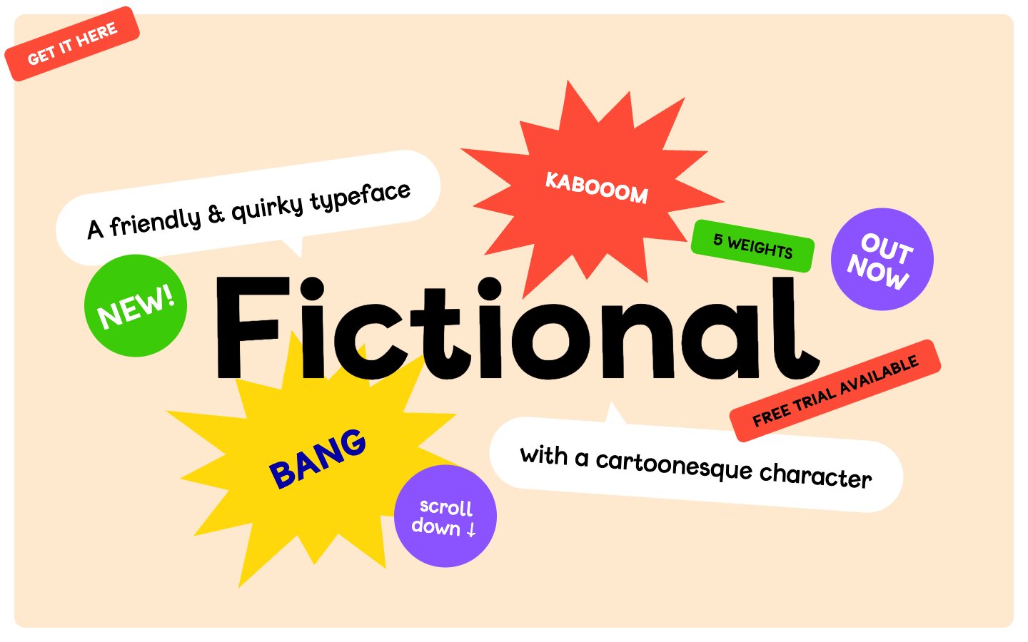
Colors
#ffe9ce Main page background — a warm, inviting canvas for playful elements
#ffffff Card surfaces, speech bubbles, primary text on dark backgrounds, ghost button borders
#000000 Primary text, prominent headings, strong outlines, and decorative fills
#8a53ff Card backgrounds, section separators, bringing a playful and energetic accent
#fd4b38 Spot illustrations, card backgrounds, accentuating elements with vibrant energy
#ffd80c Card backgrounds, decorative fills, button hover states, expressing cheerfulness
#3ccb09 Card backgrounds, small highlight elements, used sparingly for a fresh pop
#0500a3 Decorative text outlines and accent strokes, providing depth without heaviness
#666666 Secondary text, link borders, subtler interface elements
#dddddd Muted button backgrounds and subtle dividers
#101010 Input text and borders
Do
- Always use the Fictional typeface for all text elements to maintain brand personality.
- Utilize Canvas Almond (#ffe9ce) as the primary page background color for a warm, inviting foundation.
- Apply a 15px border-radius for general cards and rectangular accent elements, reserving 5px for smaller buttons and 144px for speech bubble shapes.
- Employ Type Black (#000000) for all primary text content to ensure high contrast against light backgrounds.
- Incorporate vibrant accent colors like Grape Punch (#8a53ff), Sunshine Yellow (#ffd80c), and Bubblegum Red (#fd4b38) for card backgrounds and highlight elements to create visual energy and playfulness.
- Space elements using multiples of the 6px base unit, with a preference for `elementGap` of 12px for tight clusters and `cardPadding` of 29px for content blocks.
- Use ghost buttons with Paper White text and borders for navigation and secondary actions to maintain a light, non-obtrusive interface.
Don't
- Avoid using traditional box-shadows; instead, rely on vibrant background colors and irregular shapes for element definition.
- Do not introduce additional font families; the Fictional typeface is the sole typographic voice of the brand.
- Refrain from using heavily structured grid layouts; allow elements to be positioned more organically, like 'sticker bombing'.
- Do not use dark, desaturated colors as primary background elements; the system thrives on a light, warm canvas with vivid accents.
- Avoid strictly symmetrical or rigid component designs; embrace rounded corners and slightly irregular forms.
- Never use generic blue for primary interactive elements; leverage the brand's vibrant palette, especially Grape Punch, Leafy Green, or Bubblegum Red.
- Do not apply padding to ghost buttons; they should appear as text-only interactive elements framed by their borders.