PUBLIC REFERENCE
Dia Browser
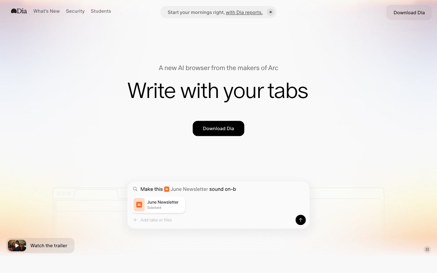
Prism on white stationery — light refracts color from a nearly monochrome surface.
Colors
#000000 Primary text, headings, nav links, borders, icon fills — the sole chromatic anchor in an otherwise gray system
#ffffff Card backgrounds (at 90% opacity), base fills, overlay surfaces
#f8f8f8 Page background (--background token), the overall canvas beneath frosted cards
#efefef Header background, subtle section dividers
#d9d9d9 Filled button backgrounds ("Download Dia") — neutral gray buttons avoid competing with content; a deliberate anti-CTA that says 'ready when you are'
#636363 Body text, secondary copy, subheadings beneath display type
#959595 Tertiary text, nav labels, metadata captions
#aeaeae Disabled states, carousel indicator dots, icon strokes
#7c7c7c Subtle borders, secondary body text
#fa3d1d The signature chromatic moment — ambient hero glow and decorative accent strip; this gradient IS the brand color, appearing where a logo mark would in other systems; Gradient stop — the red accent, available as --red token for error or emphasis states
#c679c4 Gradient stop — pink/mauve tone at the warm edge of the spectrum
#ffb005 Gradient stop — warm amber center of the spectrum, available as --yellow token
#0358f7 Gradient stop — the cool end of the spectrum, available as --blue token for links or informational highlights
#fd02f5 Available as --pink token for highlight or playful accent contexts
Do
- Use the spectrum gradient (pink → red → amber → lavender → blue) ONLY as ambient background glow or decorative strip — never as text color or button fill
- Keep buttons neutral gray (#D9D9D9) or transparent; the system deliberately avoids chromatic CTAs to keep focus on content
- Apply 30px border-radius consistently to cards and filled buttons; use 9999px pill radius only for ghost/tab buttons
- Use ABC Oracle weight 300 for all display text (50px+) with -0.04em letter-spacing; weight 500 only for buttons and labels ≤16px
- Apply backdrop-filter: blur(24px) with rgba(255,255,255,0.9) for any elevated surface to maintain the frosted-glass layering
- Maintain the rgba(0,0,0,0.08) 0px 0px 8px 0px shadow on all floating cards — this is the only shadow in the system
- Use #636363 for body text and #959595 for tertiary/metadata text against the #F8F8F8 canvas
Don't
- Never use saturated colors (--red, --blue, --pink, --yellow) as solid backgrounds or button fills — they exist only within the gradient and as design tokens for rare micro-accents
- Never use border-radius less than 10px on any element; the system has no sharp corners
- Never use font weights above 500 — there is no bold (600/700/800) anywhere in this system
- Never add drop shadows beyond the single 8px blur shadow; avoid layered or colored shadows
- Never place dark backgrounds behind content sections; the system is exclusively light with the gradient as the only warm/dark element
- Never use underlined links with color changes — links stay #000000 and only animate underline opacity on hover
- Never introduce a second typeface; the entire system runs on a single family at three weights