PUBLIC REFERENCE
BMW.com
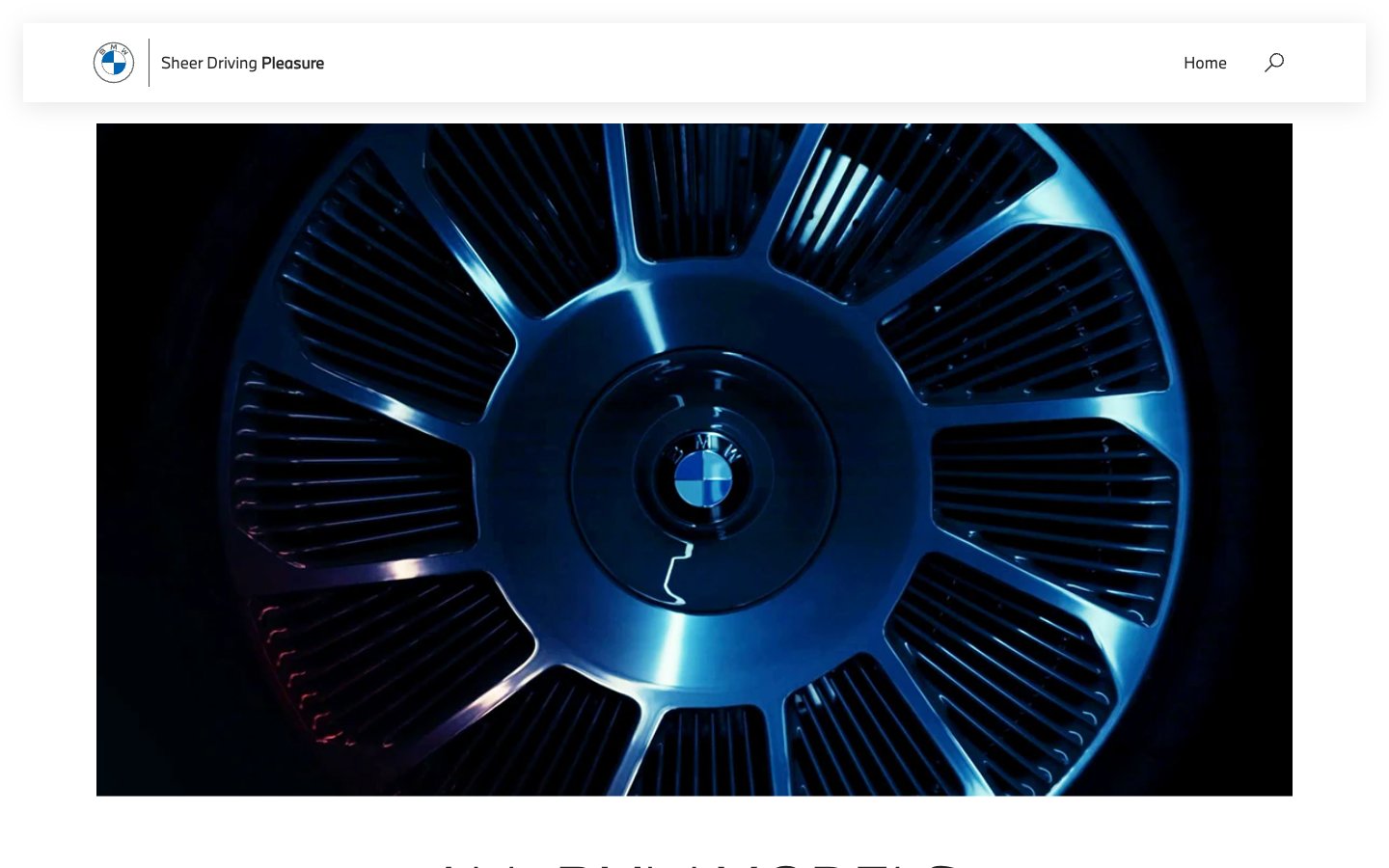
Precision-engineered monochrome luxury; every detail is intentional, nothing is superfluous.
Colors
Obsidian
#262626 Primary text, interactive elements, navigation links, button text — forms the core dark against light contrast.
Canvas White
#ffffff Page backgrounds, card surfaces, prominent navigational elements — establishes the primary visual canvas.
Graphite Grey
#bbbbbb Secondary navigation text, subtle borders, contextual information — provides sufficient contrast on dark surfaces while appearing subdued on light ones.
Frost
#f1f1f1 Subtle background accents, dividers — provides a very light contrast against Canvas White.
Deep Space
#262626 Footer background — anchors the page with a solid, dark foundation.
Electric Blue
#1c69d4 Interactive highlights, focus states — a vibrant, technical accent for user interaction.
Do
- Prioritize BMWTypeNextLatin for all text elements to maintain brand consistency.
- Use Canvas White (#ffffff) as the dominant background color for main content areas.
- Apply Obsidian (#262626) for primary text and interactive elements to ensure high contrast.
- Utilize BMWTypeNextLatin Light weight 300 at 60px for prominent headings to create an impactful yet refined statement.
- Maintain zero border-radius on all components to preserve the precise, angular aesthetic.
- Employ Electric Blue (#1c69d4) sparingly for interactive highlights and focus states, ensuring it stands out against the monochrome palette.
Don't
- Avoid using saturated or chromatic colors outside of the designated Electric Blue accent.
- Do not introduce rounded corners or soft shapes, as the aesthetic is defined by sharp precision.
- Refrain from heavy shadows or overt elevation a primary means of drawing attention; rely on typography and strong contrast.
- Do not deviate from the BMWTypeNextLatin font family; consistency is key to the brand's visual identity.
- Avoid excessive padding around interactive textual elements like links; use 0-12px as seen in button examples.