PUBLIC REFERENCE
Render
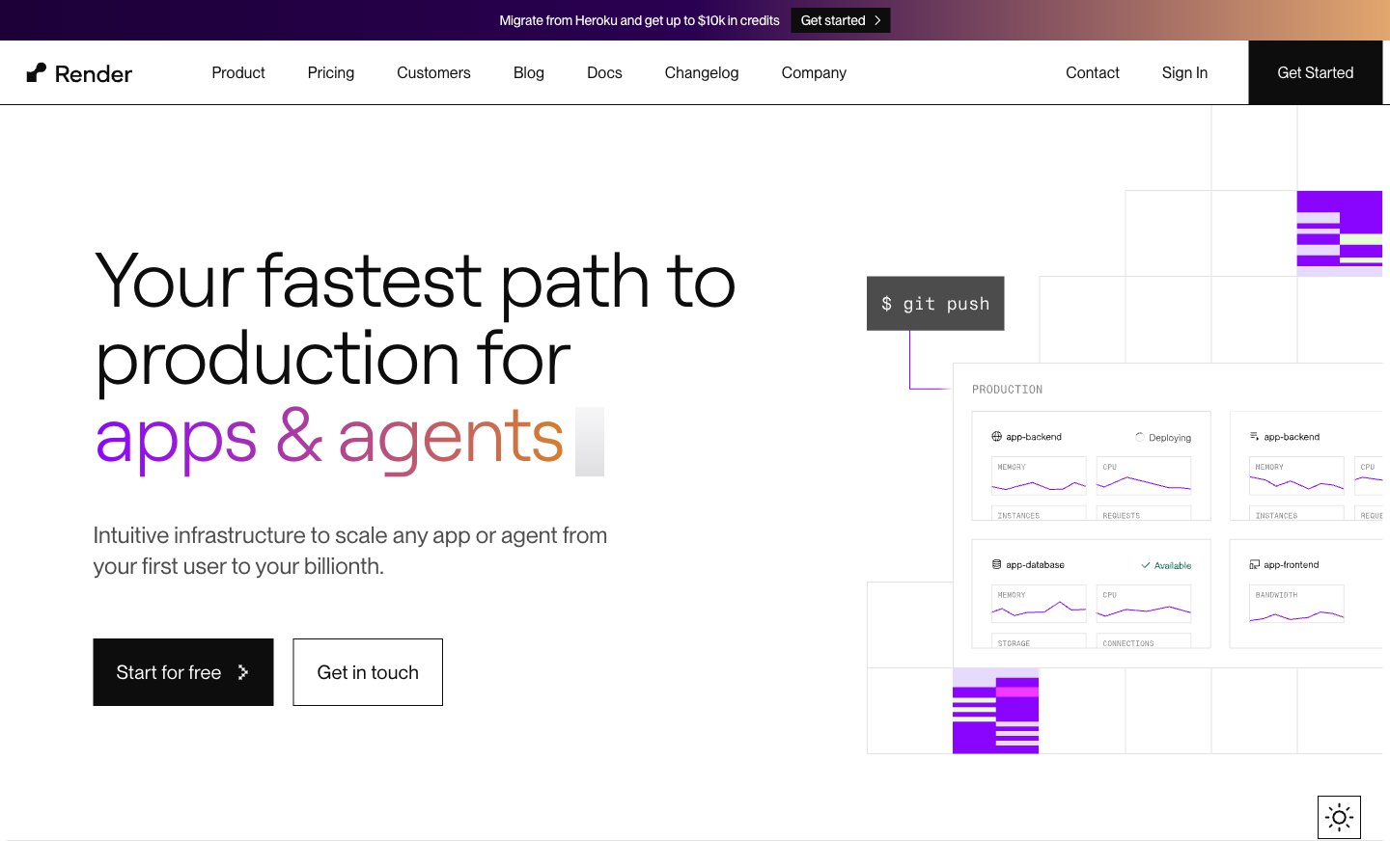
Crisp canvas, gradient fireworks. A bright, white backdrop that provides contrast for a constellation of colorful gradients and powerful typography.
Colors
#ffffff Primary page and component backgrounds, offering a pristine, expansive base for content.
#0d0d0d Primary text color for headlines and body copy, ensuring strong contrast against light backgrounds.
#272727 Darker borders and subtle background elements, providing visual separation without harshness.
#4d4d4d Secondary text, navigation items, and less prominent text, offering a softened contrast.
#6b6b6b Tertiary text, subtle descriptions, and inactive states.
#e3e3e3 Borders, dividers, and subtle background fills, establishing visual structure on cards and sections.
#e6daff Lightest accent background for navigation states and contextual highlights.
#e0f4ff Background for specific informational sections or subtle visual separation.
#8a05ff Highlight elements, interactive states, and specific brand feature callouts – the primary accent color.
#d67f2 Prominent headings and visual highlights, signifying importance and drawing immediate attention with its vibrant energy.
#009e7a Specific callouts and highlighted text/icons, indicating positive states or unique offerings.
#48008c Link states and stronger purple accents, providing depth to interactive elements.
#e96770 Highlighting specific sections and attention-grabbing elements, signaling urgency or novelty.
#f347ff Secondary vibrant accent, used for diverse visual elements to add a playful yet modern touch.
#33acff Secondary accent for active states and informational elements, providing a clear, bright contrast.
#8a05ff Used for hero sections and distinctive backgrounds, creating a sense of depth and advanced technology.
#9b52fb Used for specific interactive elements or visual flourishes, adding a dynamic and soft touch.
Do
- Use Charcoal Text (`#0d0d0d`) for all primary text against white backgrounds to ensure AAA contrast.
- Apply `borderRadius: 0px` for all standard buttons and cards to maintain a sharp, modern aesthetic.
- Utilize `Roobert` for all headlines with negative letter spacing (`-0.03em` to `-0.01em`) to create a signature tight, impactful look.
- Employ the `Grape Glow` (`#8a05ff`) as the primary accent for interactive elements and key numerical highlights.
- Incorporate the linear brand gradients (e.g., `linear-gradient(to right, rgb(138, 5, 255), rgb(214, 127, 46))`) for high-impact headlines or distinctive background sections.
- Maintain a clear visual hierarchy by consistently using `PPNeueMontreal` for body text and UI elements, with `16px` as a base font size.
- Ensure all interactive elements have a clear hover state, typically darkening the text or background subtly as seen on navigation items.
Don't
- Do not introduce rounded corners other than `937px` for specific pill-shaped tags to maintain the sharp aesthetic.
- Avoid using additional bright, highly saturated colors for backgrounds; reserve them for accents and gradients.
- Do not deviate from the specified font families; PPNeueMontreal and Roobert define the typographic voice.
- Do not use generic box shadows; elevation is primarily achieved through background color shifts and borders.
- Avoid overuse of the vivid accent colors; their power comes from strategic placement to highlight key information.
- Do not apply `letterSpacing: 0` to large headlines; the distinctive negative letter spacing of Roobert is crucial.
- Do not use a solid background color for the 'apps & agents' portion of the main hero headline; it must retain its gradient fill.