PUBLIC REFERENCE
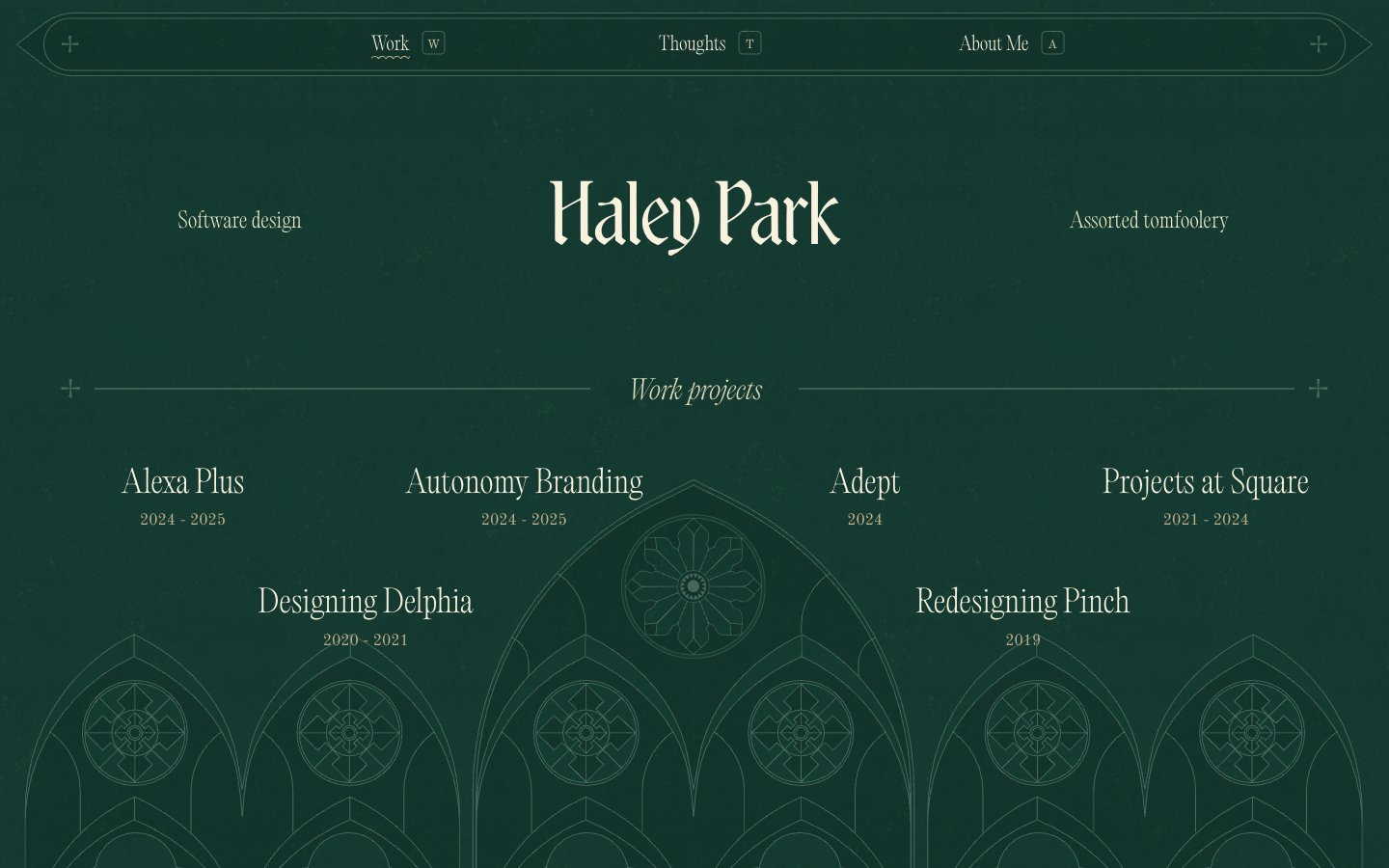
Haley Park
Gothic manuscript on dark parchment
Colors
Forest Canopy
#143930 Page background, heading background fills, primary surface. Creates a deep, contemplative atmosphere
Parchment White
#f8f2de Primary text, link text, borders, decorative accents. Its slight warmth prevents a stark contrast with the dark background, maintaining the antique feel. Used for outlined ghost buttons
Moss Line
#456859 Subtle borders, secondary decorative elements, icon outlines. Offers just enough contrast for structural lines without disrupting the soft visual texture
Do
- Prioritize Forest Canopy (#143930) for all main backgrounds to maintain the deep, dark ambiance.
- Use Parchment White (#f8f2de) exclusively for primary text, links, and borders, reserving it for elements that need to stand out from the dark background.
- Apply Moss Line (#456859) for secondary decorative strokes, subtle outlines, and subdued graphic elements to add detail without high contrast.
- Employ the 'Wispy' font (96px, 100 weight, -0.96px letter-spacing) for primary hero headlines to achieve an ethereal, elegant feel.
- Structure interactive elements like navigation and project listings with text on transparent backgrounds, using only a Parchment White (#f8f2de) border or underline for definition.
- Maintain a comfortable density with element gaps at `11px` and section gaps at `26px` to allow content to breathe without feeling sparse.
- Utilize 0px border-radius for components like project cards and buttons to reinforce a sharp, traditional print aesthetic.
Don't
- Avoid using bright, saturated colors for UI elements; stick to the muted palette provided.
- Do not introduce heavy shadows or prominent elevation; maintain a flat, layered visual approach with subtle outlines.
- Refrain from using bold or heavy font weights for headlines or primary text where lightness and elegance are key.
- Do not use large, solid background fills for interactive components; prefer ghost styles with borders or underlines.
- Avoid decorative imagery that clashes with the site's 'Gothic manuscript' aesthetic; prioritize line art, subtle textures, or classic ornaments.
- Do not deviate from the specified typefaces and their distinct letter-spacing values to preserve the unique typographic voice.
- Avoid arbitrary border radii; use 0px by default, and 4.8px very sparingly for elements that require a slight softening.