PUBLIC REFERENCE
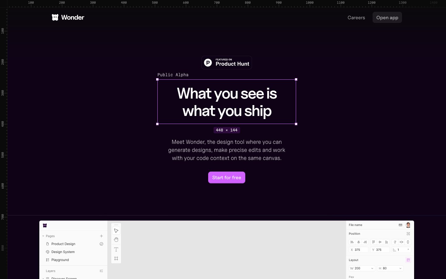
Wonder
Deep canvas, fuchsia accent
Colors
#0f0217 Primary page background, structural container backgrounds
#0b0211 Gray text accent for links, tags, and emphasized short phrases. Do not promote it to the primary CTA color
#111111 Text for inverted elements, occasionally used for badge backgrounds
#ffffff Primary text color, icon fills, and accent on light-themed or inverted elements
#e1e4e8 Muted text, placeholder text, and decorative borders on light elements
#44374a Hairline separators, subtle borders for cards, buttons, and input fields
#6f6774 Secondary text for descriptions and helper text
#737373 Tertiary text color, icon strokes and fills at lower prominence
#d262ff Primary action button backgrounds, interactive highlights, and decorative color accents
#6a1791 Decorative strokes in UI elements, subtle hover states, and brand illustration elements
#2d063a Text on very dark backgrounds, secondary heading color
#d97757 Orange text accent for links, tags, and emphasized short phrases
Do
- Always use Midnight Plum (#0f0217) as the base background for main page sections to maintain the dark theme.
- Apply Fuchsia Burst (#d262ff) for primary call-to-action buttons and key interactive elements.
- Utilize Bright Snow (#ffffff) for all primary text content against dark backgrounds to ensure high contrast.
- Reinforce interactive elements with a distinct 8px border-radius for buttons and navigation items, or a 9999px (pill-shape) for badges and inputs.
- Employ Border Violet (#44374a) for subtle borders and dividers between UI elements, creating clear but not harsh separation.
- Use Uncut Sans Variable for headlines (50px, weight 400, letter-spacing -0.0500em) to communicate authority with a unique, modern feel.
- Ensure input fields have a semi-transparent background (`rgba(255, 255, 255, 0.08)`) and Border Violet outline for a cohesive dark UI appearance.
Don't
- Avoid using highly saturated colors other than Fuchsia Burst (#d262ff) for functional interface elements; reserve other bright colors for imagery or specific, non-interactive highlights.
- Do not introduce sharp, angular cards; all cards should have a consistent 14px border-radius.
- Do not use heavy, opaque drop shadows for elevation; rely on the subtle elevation provided by `oklab(0 0 0 / 0.08) 0px 0px 0px 1px` and similar lightweight shadows.
- Do not deviate from the specified typefaces; Uncut Sans Variable, Inter, and Martian Mono are the only approved font families.
- Avoid full-bleed content sections that break the overall maximum width pattern, except for intentional heroic visual elements.
- Do not use dark text on dark backgrounds; maintain high contrast with Bright Snow (#ffffff) for readability.
- Do not use solid borders on ghost buttons; utilize the Border Violet (#44374a) for a delicate outline effect.