PUBLIC REFERENCE
Lift-off challenge
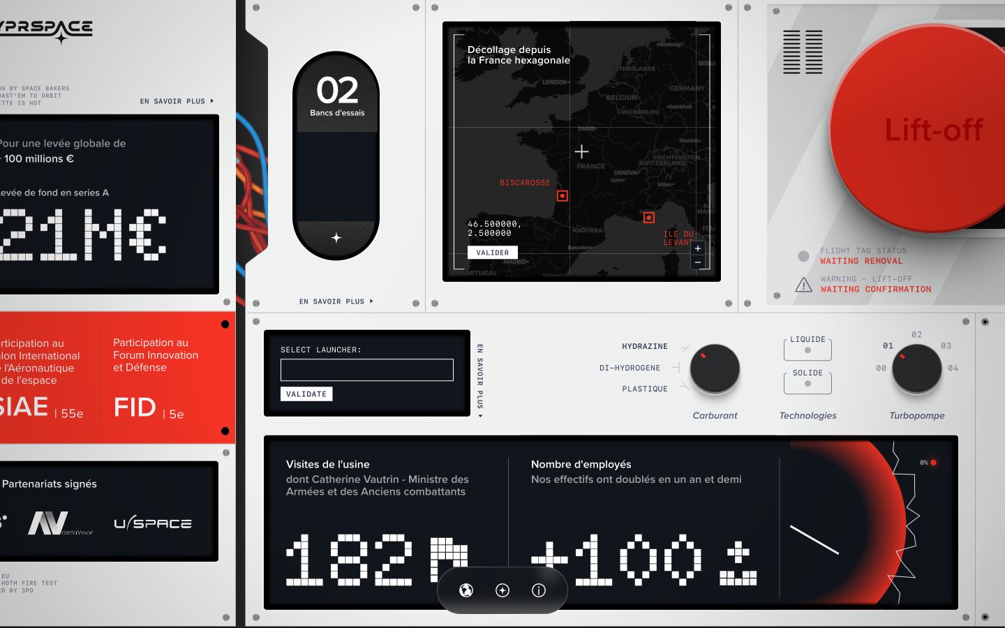
Aircraft control panel — high-contrast modular interfaces on a rigid, light-grey chassis with urgent red signals.
Colors
#e5e7eb Page canvas, primary panel background, borders, input backgrounds
#11161c Interface display backgrounds, interactive card backgrounds, dense information blocks
#000000 Primary text on light backgrounds, shadows, critical text on dark backgrounds
#ffffff Text on dark backgrounds, active elements, subtle card shadows
#bbbbbb Secondary borders, subtle background tints
#a3a3a3 Muted text, icon fills, inactive states
#575c75 Secondary text, subtle details, some icon fills
#f43325 Primary call-to-action buttons, warning indicators, critical states
#0078a8 Interactive links, specific highlights
#c9cbe4 Decorative background gradient used in some sections, suggesting cosmic or distant elements
#f43325 Strong, urgent gradients for prominent visual elements or critical interaction areas
Do
- Use Control Panel Grey #e5e7eb as the primary canvas for all page backgrounds and top-level panels.
- Apply Urgency Red #f43325 exclusively for critical action buttons and warning states, ensuring strong visual signaling.
- Implement Display Black #11161c for all interactive data displays and information cards to maintain the control panel aesthetic.
- For large numerical data, use the Doto font at 106px font size with Digital White #ffffff color against a Display Black #11161c background.
- Utilize border-radius 270.89px for primary buttons and 9999px for small, contained elements like pill buttons or tags, while using 127.397px for cards.
- Maintain high contrast text: Obsidian Grey #000000 on Control Panel Grey #e5e7eb, and Digital White #ffffff on Display Black #11161c.
- Use SF Mono for any small, technical or data-driven text elements to reinforce the retro-futuristic theme.
Don't
- Do not use gradients or colored backgrounds on general text or informational sections, as they are reserved for prominent elements like the Lift-off button.
- Avoid applying Urgency Red #f43325 for decorative purposes or non-critical text; its impact must be preserved for alerts and main calls to action.
- Do not use generic square radius for buttons; leverage the defined 270.89px or 9999px for consistent button styling.
- Refrain from using heavily saturated colors beyond Urgency Red #f43325 or Active Blue #0078a8; the color palette is intentionally restrained.
- Do not introduce drop shadows on every element; elevation is minimal, reserving white shadows for subtle card lifts and dark shadow for deeper interaction states.
- Avoid excessive spacing between elements; maintain a compact information density typical of control interfaces, using 8px as the primary element gap.
- Do not deviate from the specified font families; their distinct characteristics are crucial for maintaining the thematic integrity.