PUBLIC REFERENCE
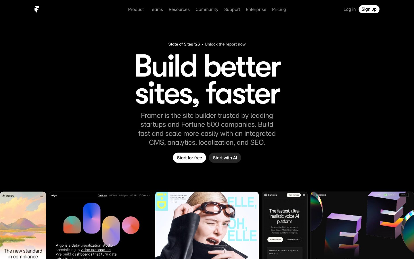
Framer
Inky command center
Colors
#000000 Page background, primary surface, deep canvas. Provides stark contrast for all content.
#080808 Secondary surface, subtle elevated panels, card backgrounds. Creates depth against Absolute Zero.
#ffffff Primary text, heading text, button text, foreground elements. High contrast for readability on dark backgrounds.
#999999 Muted text, secondary labels, disabled states. Provides subtler information.
#cccccc Sub-secondary text, dividing lines. Softer than Ash Gray for less prominent elements.
#666666 Tertiary text, less important information, placeholder text.
#171717 Tertiary surface layer, slightly darker elevated elements.
#0099ff Interactive elements, links, active states, indicators, primary accent. Draws attention and signifies action.
#0055ff Secondary accent for graphical elements, subtle interactive states where Electric Blue might be too strong for background.
#05ff9f Subtle top-to-bottom gradient for background elements, adding a hint of color variation.
#fd5d5c Highlight for specific cards or callouts, purely decorative.
#fac80a Highlight for specific cards or callouts, purely decorative.
#33c659 Highlight for specific cards or callouts, purely decorative.
#9869fd Highlight for specific cards or callouts, purely decorative.
Do
- Use Absolute Zero (#000000) as the primary background for all page sections to enforce a consistent dark theme.
- Apply Vapor White (#ffffff) for all main headings and body text on dark backgrounds to ensure maximum contrast and readability.
- Reserve Electric Blue (#0099ff) exclusively for interactive elements like links, buttons, and active states to guide user attention.
- Utilize 100px border radius for all primary calls-to-action to create distinct pill-shaped buttons.
- Employ the GT Walsheim fonts (GT Walsheim Framer Medium, GT Walsheim Medium) for all major headlines to convey the brand's unique character.
- Maintain a compact line height for all display and heading typography (e.g., 0.85 for 110px, 0.95 for 85px) to achieve a dense, type-driven aesthetic.
- Layer surfaces using Absolute Zero (#000000) and Charcoal Canvas (#080808) to create depth without relying on prominent shadows.
Don't
- Avoid using light backgrounds for entire page sections; the theme is predominantly dark.
- Do not use generic system fonts for prominent headings; GT Walsheim is critical for brand identity.
- Do not introduce additional accent colors beyond Electric Blue (#0099ff) and the designated card highlights (Tangerine, Goldenrod, Emerald, Amethyst).
- Avoid box shadows for general elevation; subtle background color shifts (e.g., #000000 to #080808) provide the primary sense of layering.
- Do not use letter-spacing: normal for headlines; specific negative letter-spacing values (-0.0500em, -0.0310em) are integral to the typographic style.
- Do not vary border radius for buttons; stick to 100px for pill shapes and 8px for cards/inputs.
- Do not introduce complex gradients or textures on primary surfaces; the background should remain clean and near-monochromatic.