PUBLIC REFERENCE
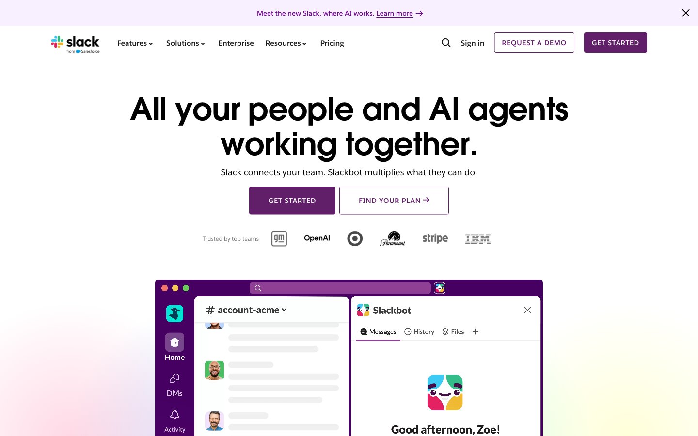
Slack
Vibrant digital workbench.
Colors
#fefbff Primary page background, expansive neutral space for content.
#ffffff Elevated card backgrounds, component containers.
#f9f0ff Subtle background for UI elements, light hovered states.
#f2defe Background for active navigation items, subtle highlights.
#000000 Primary text color for headings, body, and high-emphasis elements.
#1d1c1d Secondary text and icon color, slightly softer than Charcoal Black.
#696969 Tertiary text, muted labels, helper text.
#757575 Informational text, list item details.
#edeaed Subtle borders and dividers for UI separation.
#808080 Placeholder text, disabled states, default icon color.
#5e5d60 Specific icon color within navigation and utility areas.
#481a54 Primary brand color, used for key UI components like navigation backgrounds and interactive elements.
#611f69 Primary button background, active states, and emphasized UI elements.
#730394 Accent text, links within dark backgrounds, and subtle branding elements.
#3d0157 Text color for buttons with transparent backgrounds, emphasizing interaction.
#2e0039 Darkest brand shade, used for subtle backgrounds in branded sections.
#1264a3 Primary link color, secondary interactive elements, and highlight indicator for certain actions.
#d17dfe Accent text and graphic elements, drawing attention in a playful manner.
Do
- Prioritize Salesforce-Avant-Garde for all headings and large display text to maintain brand voice.
- Use Purple Heart (#611f69) for primary call-to-action buttons, ensuring a visible contrast against white or near-white backgrounds.
- Apply a 4px `border-radius` to all functional buttons and input fields for a consistent interactive element shape.
- Use Charcoal Black (#000000) for primary body text and headings on light backgrounds to ensure AAA contrast.
- Utilize Electric Blue (#1264a3) exclusively for interactive links and secondary accents, reserving it for clear action points.
- Maintain a comfortable `elementGap` of 16px for spacing between most UI elements, and `cardPadding` of 16px for internal card content.
- Implement the Magic Dust Gradient (linear-gradient(104deg, rgb(0, 0, 0) 9.56%, rgb(186, 1, 255) 102.66%)) sparingly, typically for hero sections or significant brand statements.
Don't
- Do not use generic system fonts; always map to Salesforce-Sans or Salesforce-Avant-Garde with appropriate substitutes.
- Avoid using multiple shades of purple for primary actions; stick to Purple Heart (#611f69) for consistency.
- Do not introduce sharp corners; maintain 4px or 16px `border-radius` based on component type, or 90px for pill shapes.
- Refrain from using Electric Blue (#1264a3) for large blocks of text; it is an accent and link color, not a primary text color.
- Do not neglect the subtle radial gradients in hero backgrounds; they contribute significantly to the playful brand feel.
- Avoid arbitrary elevation shadows; use the defined `rgba(0, 0, 0, 0.1) 0px 0px 32px 0px` for elevated elements.