PUBLIC REFERENCE
Base44
Softly Lit Gradient Canvas
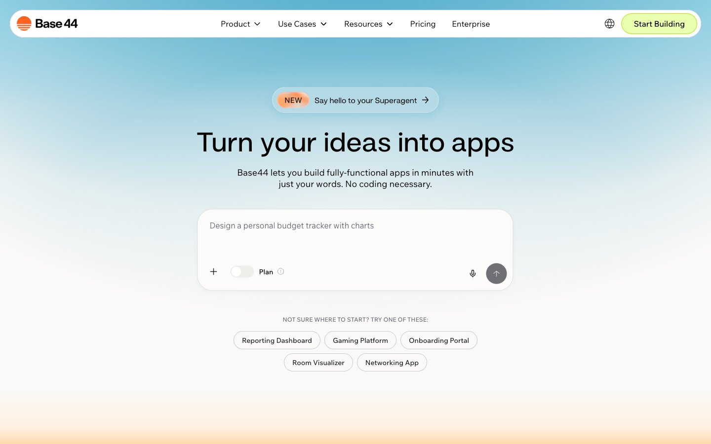
Colors
#faf9f7 Page backgrounds, subtle card surfaces
#ffffff Observed in link borderColor, other backgroundColor, button borderColor. Extracted usage does not support a distinct primary control color.
#000000 Primary text, prominent headings, strong borders
#232529 Secondary text, input placeholder text, subtle borders
#324158 Dividers, subtle accent borders on cards
#696f7b Muted body text, supportive captions, subtle input backgrounds
#e6e6e6 Backgrounds for decorative elements and subtle section dividers
#cfcfcf Default button borders, light input borders
#ade900 Primary action button borders, 'Start Building' button accent
#ebffb1 Selected item background, subtle brand highlights
#d8723c Outlined action button borders for prompts
#ff631f Decorative illustration accents, brand iconography
#F2F1ED Hero section background
#FBFBFB Hero section background
Do
- Use Canvas Pearl #faf9f7 for primary page backgrounds to maintain an airy feel.
- Apply Snowdrift White #ffffff for card surfaces and interactive elements to create soft contrast and elevation against the canvas.
- Reserve Ink Black #000000 for primary text and headings, ensuring high readability.
- Implement Ghost Button styling with a 1px Ash Border #cfcfcf and 999px border-radius for secondary actions.
- Utilize Lime Spritz #ade900 for CTA button borders and key interactive indicators, contrasting with the soft neutrals.
- Maintain a comfortable information density using an average elementGap of 10px and sectionGap of 45px.
- Employ the 999px border-radius for all primary buttons and tags to deliver a consistent, rounded interactive experience.
Don't
- Avoid using saturated background colors for large sections; gradients should remain pastel and subtle.
- Do not use dark text colors on anything but light backgrounds to preserve contrast and system aesthetic.
- Do not introduce sharp corners on interactive elements; prefer soft rounding (999px or 9.89577px) for buttons and inputs.
- Do not apply prominent box shadows for elevation; rely on subtle background color shifts or the single rgba(34, 40, 42, 0.04) 0px 3px 10px 0px for modals.
- Avoid introducing additional vivid colors outside of Lime Spritz #ade900 and Sunset Orange #d8723c to maintain focused accents.
- Do not break the established type scale; ensure all text adheres to defined sizes, weights, and line heights for consistent rhythm.
- Avoid using complex or busy background imagery; prefer soft gradients or solid colors that allow UI elements to stand out.