PUBLIC REFERENCE
Vercel
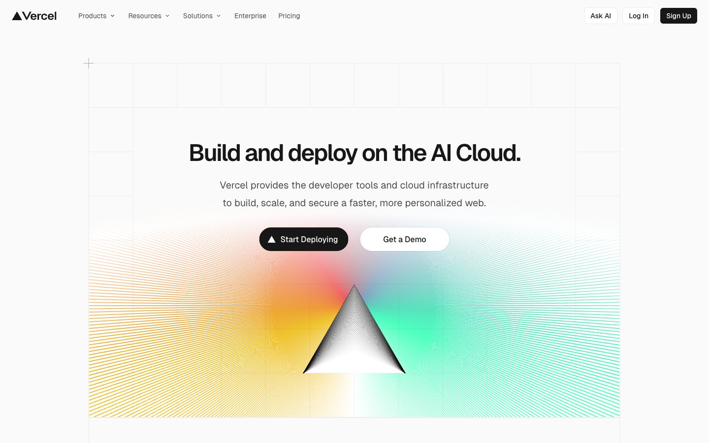
Advanced schematic on white canvas — every element precisely placed, every line deliberate.
Colors
#fafafa Page backgrounds, elevated surfaces like cards, modal backgrounds — the foundational white that ensures contrast.
#f0fbff Subtle background for UI elements, hover states, or secondary container fill, providing a soft lift from the main canvas.
#171717 Primary text, prominent headings, solid button fills for main actions – the dominant dark shade on light backgrounds.
#4d4d4d Secondary text, descriptive paragraphs, helper text, and subtle icon fills; a softer contrast than Text Primary.
#000000 Observed in nav fill, icon fill, other stroke. Extracted usage does not support a distinct primary control color.
#ebebeb Observed in other borderColor, nav borderColor, card borderColor. Extracted usage does not support a distinct primary control color.
#666666 Observed in nav borderColor, nav color, nav fill. Extracted usage does not support a distinct primary control color.
#7d7d7d Less prominent text, captions, and disabled states; provides a low contrast for tertiary information.
#52aeff Decorative highlights, very subtle background fills, borders in secondary contexts – a soft visual cue.
#e5484d Decorative highlights and borders.
#45dec5 Decorative highlights and borders.
#0070f3 Observed in nav borderColor, nav backgroundColor, nav color. Extracted usage does not support a distinct primary control color.
#eeca2d Hero section backgrounds, prominent visual accents – used to create dynamic, colorful focal points.
Do
- Use Geist font for all text elements with 'liga' and 'ss05' font feature settings enabled.
- Apply #171717 for primary text content and #fafafa for page backgrounds to maintain strong contrast.
- Round corners of all interactive elements like buttons and tags with `borderRadius: 9999px` for a continuous pill shape when content allows, or `borderRadius: 100px` for less extreme pill shapes.
- Maintain a clear visual hierarchy using #171717 for headings and primary actions, and #4d4d4d for supporting text.
- Introduce elements elevation using `box-shadow: rgba(0, 0, 0, 0.08) 0px 0px 0px 1px, rgba(0, 0, 0, 0.04) 0px 2px 2px 0px, rgb(250, 250, 250) 0px 0px 0px 1px` for cards and interactive components.
- Use Electric Blue (#0070f3) exclusively for critical interactive states, active navigation, or significant accents.
- Keep element spacing tight, using `12px` for gaps between related elements.
Don't
- Avoid using multiple chromatic colors for primary UI elements; reserve them for decorative highlights or specific branding.
- Do not use generic system fonts; always utilize Geist and Geist Mono for maintaining brand consistency.
- Refrain from heavy, diffused shadows; prefer crisp, subtle box shadows with minimal offset.
- Do not use letter spacing on body or paragraph text; apply negative letter spacing only to display and larger headings as specified.
- Avoid arbitrary border radii; stick to the defined 6px, 64px, 100px, or 9999px tokens.
- Do not rely on opaque solid backgrounds for content cards when a transparent or border-defined card variant is more appropriate.
- Do not use a large number of distinct background colors; focus on the primary `Cloud Canvas` and `Storm Gray Wash` neutrals.