PUBLIC REFERENCE
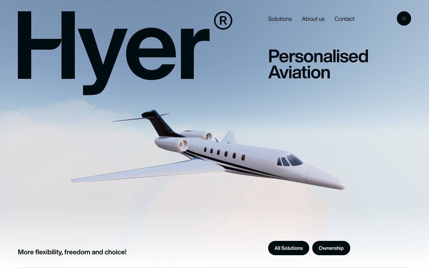
Hyer Aviation
monochromatic luxury, sharp contrast
Colors
Obsidian
#000d10 Primary text, dark surface backgrounds, button backgrounds, interactive elements, nav text. Creates a dominant, authoritative presence
Canvas White
#ffffff Page backgrounds, light surface backgrounds, secondary text, button text, icons. Provides a clean, expansive foundation
Slate Mist
#8e8e95 Muted body text, navigation dividers, subtle borders. Used for secondary information that lives harmoniously within the high-contrast system
Desert Sienna
#bc7155 Accent for call-to-action buttons, prominent graphical elements. This warm, earthy tone provides the only saturated color highlight, drawing attention with understated luxury
Do
- Prioritize Canvas White (#ffffff) for primary backgrounds and Obsidian (#000d10) for primary text to maintain high contrast (19.7:1 AAA).
- Use HelveticaNowDisplay consistently across all text, emphasizing weight 700 for headings and weight 400 for body text.
- Apply a 1000px border-radius to all buttons and prominent links to achieve the signature pill shape.
- Reserve Desert Sienna (#bc7155) exclusively for primary action buttons to create a single, clear focal point.
- Ensure generous spacing: utilize 23px for element gaps and 68px between major sections.
- Employ negative letter-spacing for large headlines to condense text and enhance impact, specifically -0.02em at sizes like 187px.
- Use Slate Mist (#8e8e95) for supporting text and subtle UI elements where less visual weight is desired, such as form helper text or secondary navigation.
Don't
- Avoid using multiple saturated colors; Desert Sienna (#bc7155) is the singular accent color.
- Do not introduce complex gradients or shadows, as the system relies on flat surfaces and high contrast.
- Refrain from using smaller body text sizes than 17px to maintain readability and design gravitas.
- Do not deviate from the HelveticaNowDisplay font for any brand-related text.
- Avoid tight spacing around interactive elements; maintain a minimum of 22px horizontal padding for buttons.
- Do not use square or mildly rounded corners for buttons; the pill shape (1000px radius) is critical for brand identity.
- Do not use generic gray tones for text; ensure body text aligns with Obsidian (#000d10) or Slate Mist (#8e8e95) to maintain the established hierarchy.