PUBLIC REFERENCE
Playful
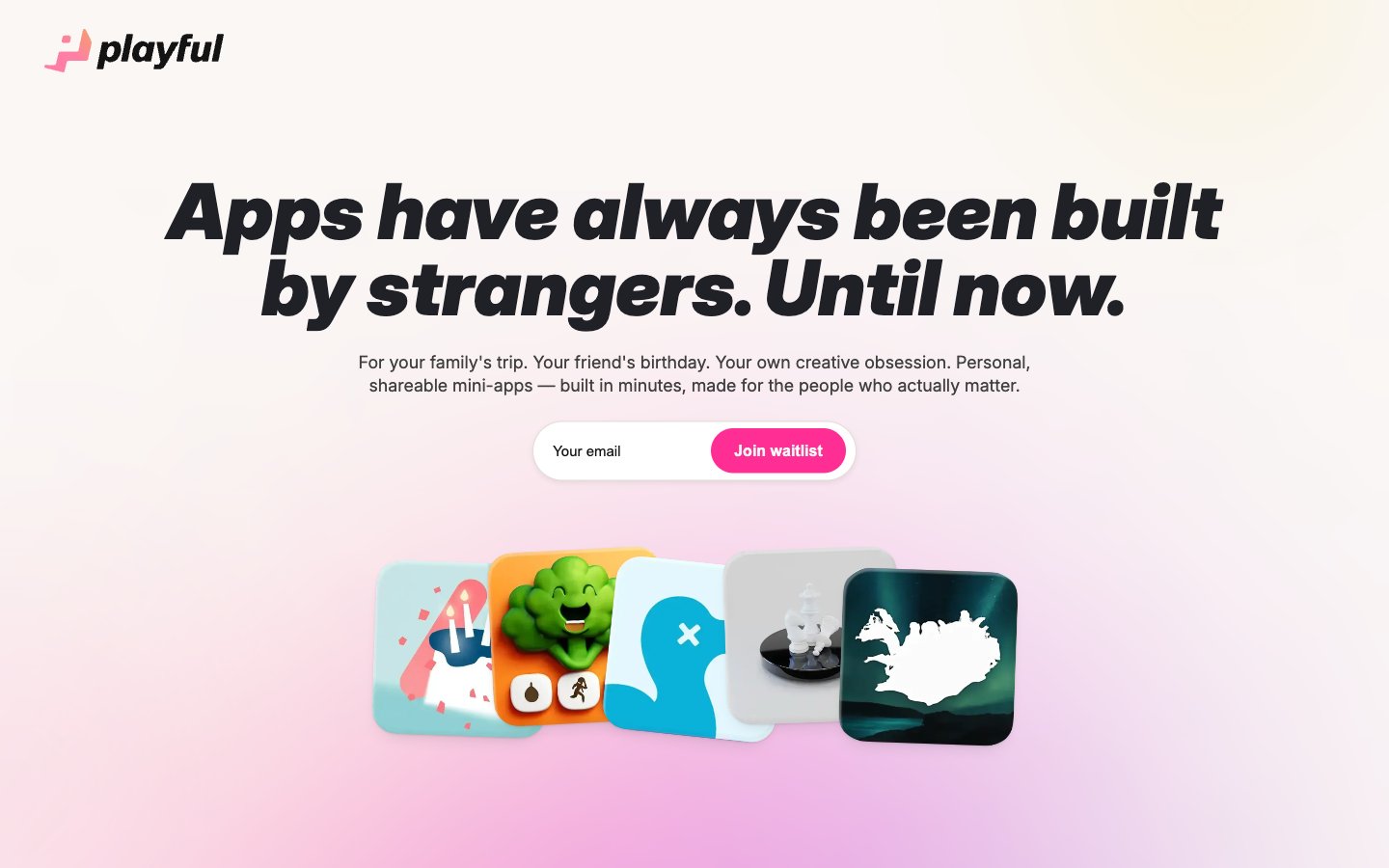
Gradient Playground
Colors
#0f172a Primary text, deep neutrals for icons and borders. This near-black provides strong contrast against light surfaces
#ff2e95 CTA buttons, accented links, and vibrant highlights — this vivid pink defines primary interactivity and branded elements
#f6f2ee Primary page background, footer background, and subtle secondary button backgrounds. It provides a warm, soft base; Hero section and key visual backgrounds – a soft, multi-hued gradient establishing a playful and spacious atmosphere
#000000 Deepest text for headlines and critical user interface elements, providing absolute contrast. Also used for dark component backgrounds and shadows
#111111 Card backgrounds, section headers, and dark surface accents
#202126 Headline text for secondary sections
#e8e5e0 Subtle borders and dividers, providing visual structure without harsh lines
#ffffff Input fields, content backgrounds within cards, and for text on dark backgrounds
#414040 Input field text, placeholder text, and muted body copy
#e2dcd6 Delicate borders and secondary structural elements
#353535 Darkest background for subtle overlays or components
Do
- Always use a generous `sectionGap` of 113px to maintain spaciousness between primary content blocks.
- Apply `border-radius: 44px` to article cards and larger UI containers to soften surfaces and align with the playful aesthetic.
- Utilize 'Vivacious Pink' (#ff2e95) exclusively for primary calls to action, active navigation states, and key interactive highlights.
- Ensure all primary headings use Inter font with `letter-spacing: -0.002em` to achieve a compact, signature appearance.
- Prioritize 'Frost Canvas' (#f6f2ee) for main page backgrounds to maintain a light and airy feel.
- Employ the dual shadow `rgba(0, 0, 0, 0.22) 0px 32px 80px 0px, rgba(0, 0, 0, 0.08) 0px 2px 8px 0px` for elevated cards.
- Use 'Midnight Ink' (#0f172a) for body text and secondary element borders for strong contrast and clarity.
Don't
- Do not use dark backgrounds for sections that contain extensive body copy; maintain a light background to preserve readability.
- Avoid arbitrary border radii; stick to the established system tokens: 44px for cards, 99px for buttons, 16px for images.
- Never introduce new chromatic colors outside of 'Vivacious Pink' (#ff2e95) and the brand gradient for UI elements.
- Do not use a default system font for any body text or headings; 'Inter' is paramount for brand identity.
- Avoid dense, information-heavy blocks without sufficient padding or `elementGap` of at least 10px.
- Do not add any additional box-shadows to elements other than cards; rely on the subtle elevation provided by background color differences.