PUBLIC REFERENCE
Contractbook
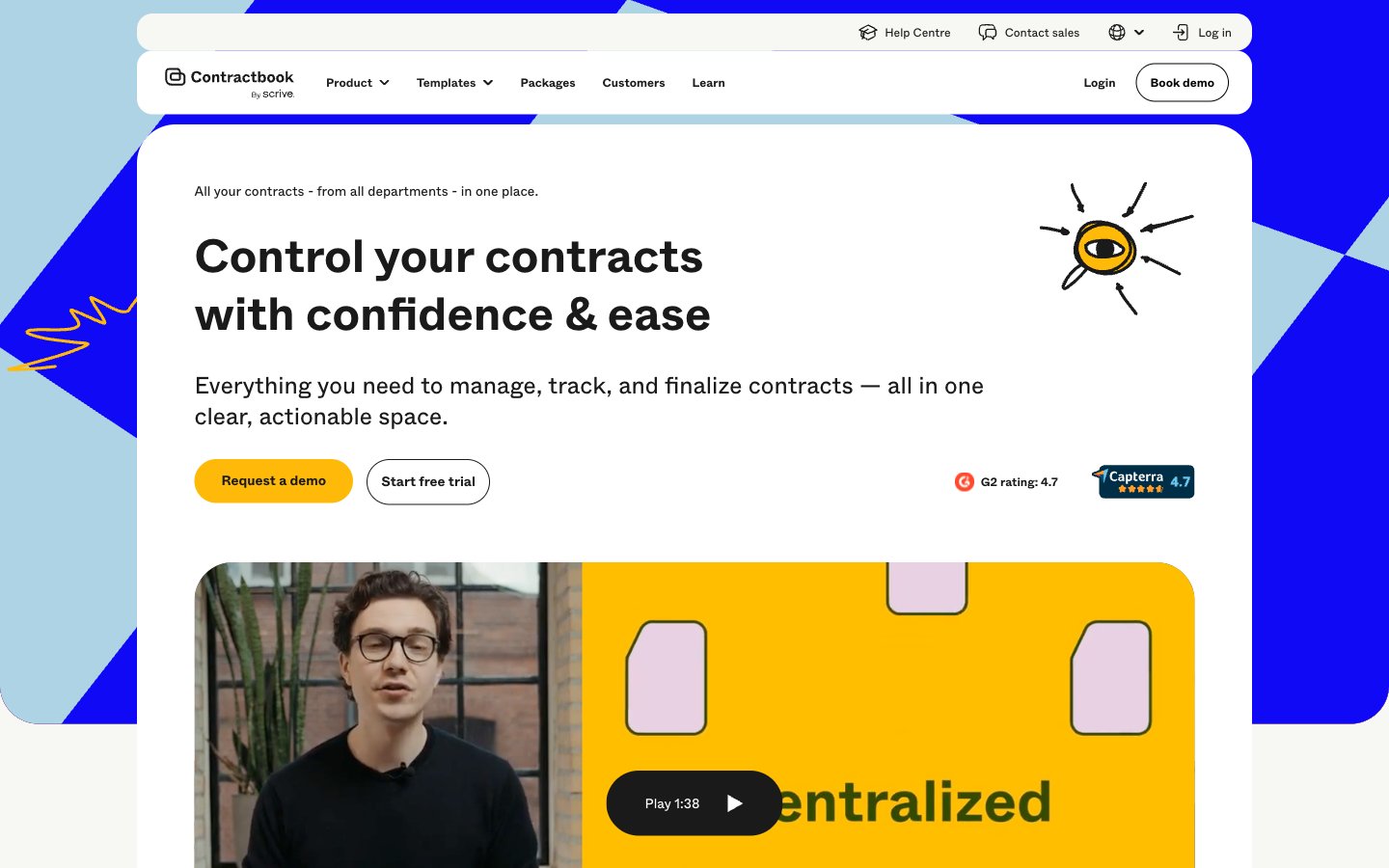
Playful professionalism, high-contrast clarity.
Colors
#1a1a1a Primary text, icon default, borders, dark overlay backgrounds — providing strong contrast on light surfaces
#ffffff Page backgrounds, card surfaces, button backgrounds — the primary canvas for content
#f7f7f3 Subtle background for secondary cards and sections — offering a soft visual break from Pure White
#f0f0ec Input fields, secondary card backgrounds, muted link backgrounds — a soft, tactile neutral for interactive elements and subtle content grouping
#000000 Strongest text contrast, button text on light backgrounds, hairline borders — used sparingly for maximum impact
#d4d4d0 Muted text, subtle dividers, inactive states — providing soft delineation without harshness
#6d6868 Placeholder text, secondary link text, less prominent UI elements — for reduced visual weight
#b3b3b3 Input field borders, disabled element borders — a light, unobtrusive boundary
#1009f6 Powerful accent color for key cards, button borders, and statement headlines — commands attention
#ffba09 Primary call-to-action buttons, prominent interactive elements, highlighted card backgrounds — indicates action and importance
#add3e5 Light background for informational cards, decorative accents in illustrations — adds a soft, approachable coolness
#304801 Rich background for specific content cards or accents — a grounded, natural tone
#e3c7de Soft accent for illustrations, decorative elements, or secondary headings — hints at creativity
Do
- Prioritize Energy Gold (#ffba09) for all primary calls to action, ensuring immediate visual recognition.
- Use Abcwhyte font for all text content, maintaining consistency across headings, body, and UI elements.
- Apply 999px border-radius to all buttons and form fields to achieve a consistent pill-like or softly rounded appearance.
- Employ Washed Black (#1a1a1a) for primary text on light backgrounds to maximize readability.
- Leverage Royal Blue (#1009f6) and Energy Gold (#ffba09) as prominent accent colors for key content blocks or interactive states.
- Maintain generous section gaps of 60px to provide ample breathing room between content blocks and improve content scanning.
- Utilize Pure White (#ffffff) and Pearl (#f7f7f3) as primary and secondary background surfaces to create a clean, light canvas.
Don't
- Avoid using multiple font families; Abcwhyte is the sole typeface for this system.
- Do not introduce strong drop shadows; rely on color blocking and border radii for visual separation and distinction.
- Refrain from complex gradients or textures on primary UI elements; maintain clean, solid color fills.
- Do not use highly saturated colors for large areas of text to avoid strain; reserve vibrant colors for accents and actionable elements.
- Avoid arbitrary border-radii; adhere to the established radii of 24px, 40px, 999px, and 4.375px.
- Do not overcrowd sections; ensure comfortable element gaps of 14px and robust card padding for readability.
- Avoid using any non-system greys; stick to the defined neutral palette for consistency and accessibility.