PUBLIC REFERENCE
monopo saigon
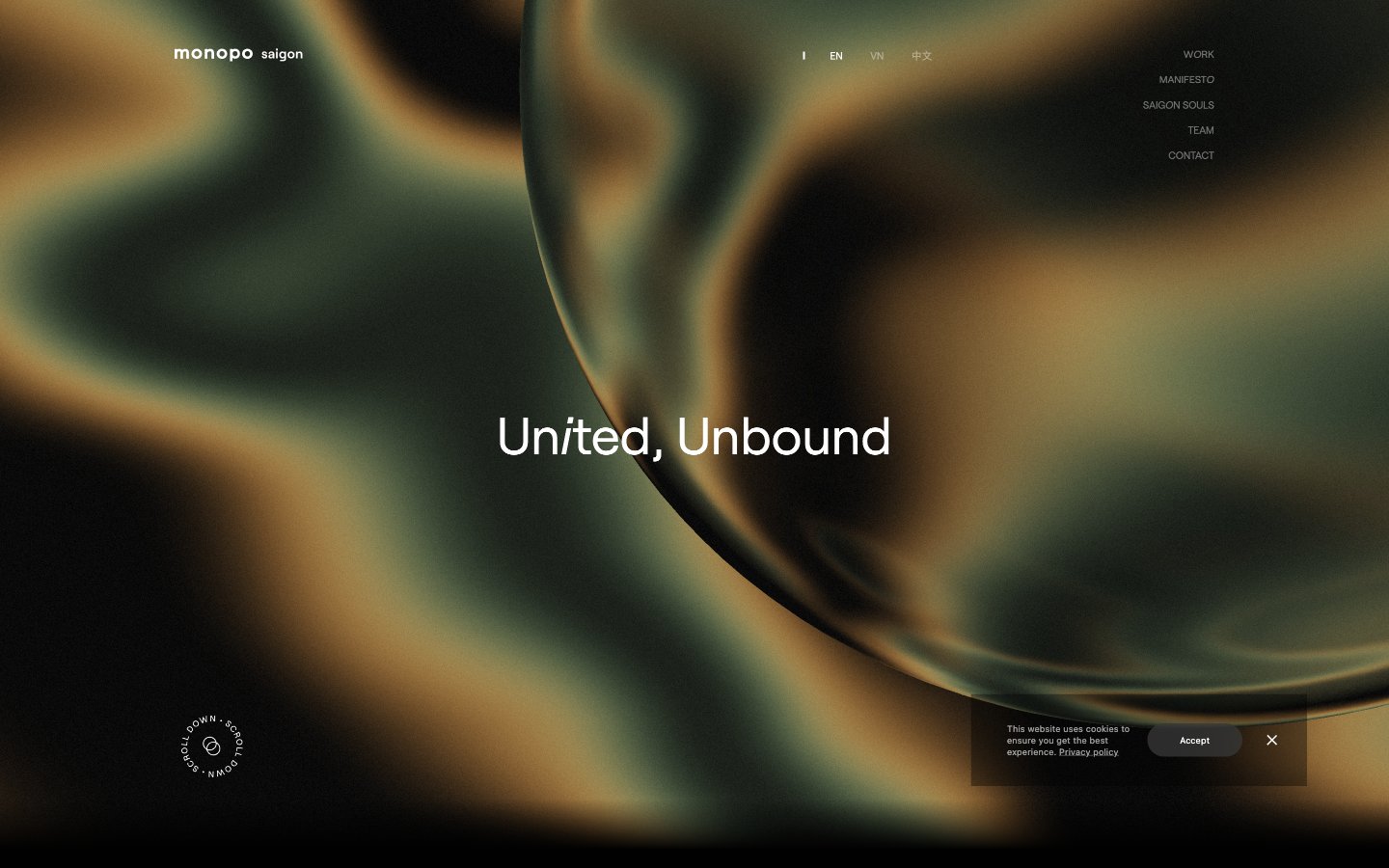
Shifting gradient depths on frosted glass
Colors
Midnight Canvas
#000000 Primary background for pages, cards, and dark-themed sections
Frost White
#ffffff Primary text color, link defaults, borders for ghost components, and accents against dark backgrounds. Used for text on primary buttons
Deep Shadow
#181818 Secondary text in footers and less prominent information. Subtly darker borders
Whisper Gray
#6d6d6d Muted body text and auxiliary text where lower contrast is desired
Misty Gray
#636363 Background for subtle, low-contrast interactive elements like the cookie consent button
Deep Ocean Gradient
#a0e0ab Atmospheric background for hero sections and full-bleed visual elements, creating an immersive, fluid environment
Do
- Prioritize Roobert as the primary typeface for all textual content, utilizing its diverse weights to establish hierarchy.
- Maintain a spacious layout with a base unit of 4px and aim for an element gap of 14px to ensure visual breathing room.
- Use Midnight Canvas (#000000) for all primary backgrounds and Frost White (#ffffff) for primary text to ensure high contrast.
- Apply a border-radius of 75.024px to all buttons for a distinctly rounded, pill-like appearance.
- Implement the Deep Ocean Gradient (linear-gradient(90deg, rgb(160, 224, 171), rgb(255, 172, 46) 50%, rgb(165, 45, 37))) as a background for hero and large interactive sections.
- Ensure interactive elements like buttons and links use Frost White (#ffffff) text against dark backgrounds unless a specific muted tone (Whisper Gray #6d6d6d) is explicitly called for.
- Use a subtle 1px border with rgba(255, 255, 255, 0.3) for ghost buttons to maintain a minimalist aesthetic.
Don't
- Avoid using harsh, saturated accent colors that would disrupt the site's subdued and atmospheric palette.
- Do not introduce square or sharp borders on interactive elements; button radii should always be 75.024px.
- Refrain from using strong box-shadows or heavy elevation, as the design relies on gradient depth rather than layered elements.
- Do not deviate from the specified Roobert and Raleway font families; avoid generic system fonts for branding elements.
- Avoid tight information density; maintain spacious relationships between elements and sections.
- Do not treat #636363 as a primary action color; reserve it for specific, muted interactive elements like secondary consent buttons.
- Never use solid color backgrounds in feature sections where the organic gradient is intended to create atmosphere.