Linear
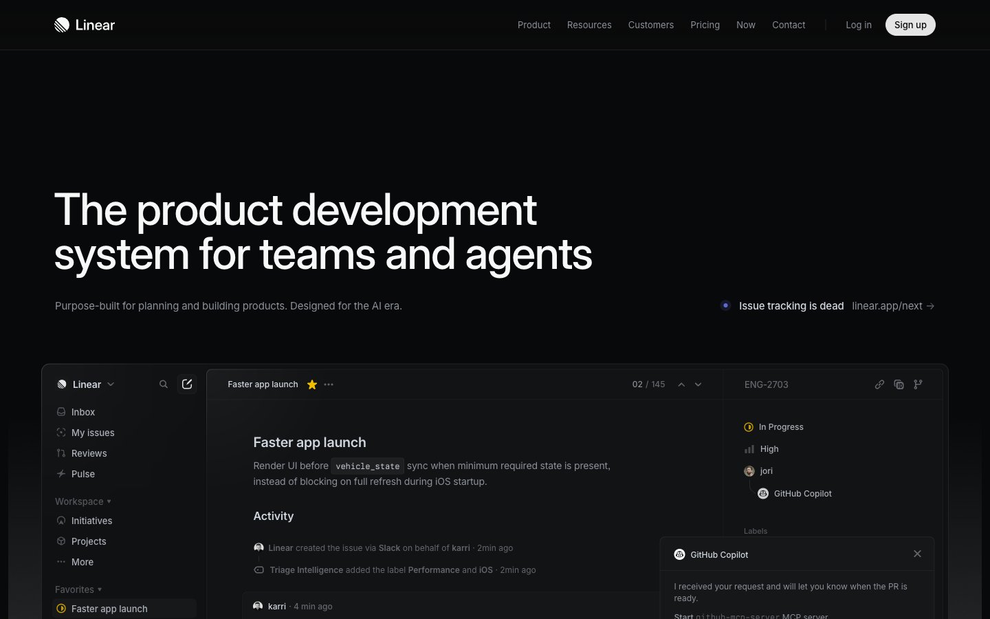
Midnight Command Center: A dark, layered interface lit by precise accents, like a high-tech control panel.
Palette
#08090aPage background, primary surface for base elements, subtly integrated into shadows for depth.
#0f1011Elevated card backgrounds, slightly lighter than the canvas to denote layering.
#161718Secondary elevated card backgrounds, providing another layer of visual hierarchy.
#23252aBorders and some shadowed card surfaces, framing elements with a subtle distinction.
#323334Subtle borders and dividers, indicating soft separations within the dark theme.
#383b3fTertiary background elements and input borders, a darker neutral for functional elements.
#f7f8f8Primary text and icons, providing strong contrast for readability against dark backgrounds.
#d0d6e0Secondary text and borders, for less prominent information or structural lines.
#8a8f98Tertiary text, descriptive labels, and inactive states, recedes into the background for low-priority details.
#62666dMuted text for metadata, timestamps, and further de-emphasized content.
#e5e5e6Informational borders and subtle fills, often seen in code blocks or explanatory components.
#e4f222Primary action indicators, active states, and focus elements — a high-energy focal point.
Type & geometry
role: Primary UI typeface for all content including headings, body text, and interactive elements. Its variable weights provide a clean, modern aesthetic with strong technical readability. · sizes: 10px, 11px, 12px, 13px, 14px, 15px, 16px, 17px, 20px, 24px, 32px, 48px, 64px, 72px · family: Inter Variable · weight: 300, 400, 510, 590 · weights: 300,400,510,590 · lineHeight: 1.00, 1.13, 1.20, 1.33, 1.40, 1.47, 1.50, 1.60, 2.00, 2.46, 2.75 · substitute: Inter · letterSpacing: -0.22, -0.15, -0.13, -0.12, -0.11, -0.1 · fontFeatureSettings: "cv01", "ss03"role: Monospaced font for code snippets, technical details, and certain data displays, ensuring consistent character alignment and technical clarity. · sizes: 12px, 13px, 14px · family: Berkeley Mono · weight: 400 · weights: 400 · lineHeight: 1.30, 1.40, 1.50, 1.71 · substitute: IBM Plex Mono · letterSpacing: -0.15Use with judgment.
- Use 'Pitch Black' (#08090a) for the primary page background to establish the dark theme.
- Apply 'Porcelain' (#f7f8f8) for all primary text and important icons to ensure readability.
- Highlight primary interactive elements exclusively with 'Neon Lime' (#e4f222) as a background, restricting its use to guide user attention.
- Create depth and hierarchy by layering surfaces using 'Pitch Black' (#08090a), 'Graphite' (#0f1011), and 'Deep Slate' (#161718) backgrounds.
- Employ the Inter Variable font family with specific letter-spacing adjustments for all UI text, such as -0.22px for display sizes and -0.11px for body text, to maintain a tight, precise feel.
- Do not introduce additional bright or saturated colors beyond 'Neon Lime' (#e4f222) for interactive elements; maintain its singular role.
- Avoid using harsh white backgrounds or light-themed patterns, as the system is anchored in a dark mode aesthetic.
- Do not deviate from the specified typeface choices; 'Inter Variable' and 'Berkeley Mono' are fundamental to the visual identity.
- Refrain from using strong, diffuse shadows; elevation is achieved through subtle layering and sharp, contained shadows like rgba(0, 0, 0, 0.4) 0px 2px 4px 0px.
- Do not apply broad, decorative background gradients across large sections of the UI; gradients are subtle and contained to specific functional areas.