PUBLIC REFERENCE
Airbnb
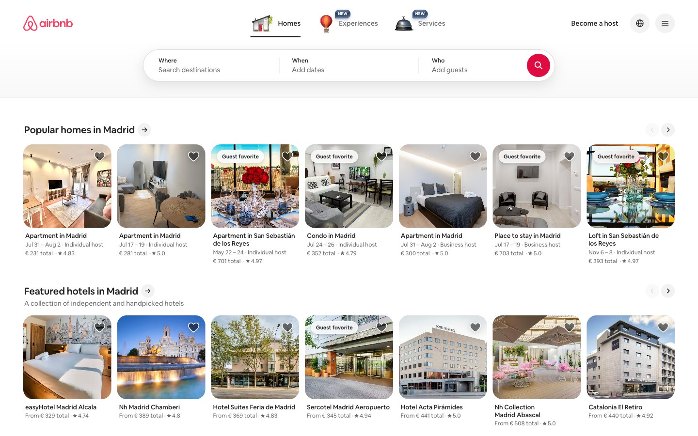
Vacation photos pinned to a white corkboard — bright photography contained in rounded frames against a near-white surface, with a single coral pin holding everything together.
Colors
#ff385c Brand logo fill, active nav underline, search button icon background, carousel dot active state — the single chromatic signature that makes the interface recognizable
#e00b41 Hover state darkening of Rausch Coral on interactive brand elements
#222222 Primary text, headings, borders, icon strokes — the dominant neutral forming almost all typographic content
#6a6a6a Secondary text (metadata, subtext, secondary labels), secondary icon fill
#c1c1c1 Disabled button text and icon strokes, inactive carousel navigation arrows
#b0b0b0 Skeleton/loading placeholder backgrounds
#dddddd Card image placeholder backgrounds, tertiary borders, disabled borders
#ebebeb Subtle dividers and secondary section borders
#f7f7f7 Page canvas, footer background, button hover/selected state background
#ffffff Card surfaces, header background, modal/popover backgrounds, pill badge fills
Do
- Use #ff385c exclusively for the brand logo, the search trigger button background, and active/selected state indicators — never for decorative fills or text blocks.
- Apply 20px border-radius to all listing cards and the main search bar container; use 8px for filter pill buttons and input fields; reserve 50% (circular) for icon-only buttons.
- Set all typography in Airbnb Cereal VF (substitute: Inter Variable) with font-feature-settings: 'salt'; apply letter-spacing -0.02em at 20px+ sizes and +0.04em for small-caps labels at 11–12px.
- Layer shadows as the three-value stack — rgba(0,0,0,0.02) 0px 0px 0px 1px, rgba(0,0,0,0.04) 0px 2px 6px 0px, rgba(0,0,0,0.1) 0px 4px 8px 0px — on elevated containers like the search bar and modals only; listing cards use no shadow.
- Maintain the surface hierarchy strictly: page canvas #f7f7f7 → card/header surface #ffffff → disabled/placeholder fills #dddddd → skeleton loaders #b0b0b0.
- Keep section headings at 22px weight 600 with the inline arrow-link pattern; use 14px weight 400 #6a6a6a for all metadata (dates, host type, review counts).
- Use 12px as the base gap for intra-card elements and 48px for vertical section rhythm between listing rows.
Don't
- Never use #ff385c for body text, headings, or decorative strokes — its appearance outside logo/search-button/active-states breaks the signature scarcity of the brand color.
- Don't add heavy drop shadows to listing cards — cards use no shadow; the #dddddd placeholder color and 20px radius carry the visual weight without elevation.
- Never set headings above weight 700 or below weight 500; Airbnb Cereal VF at weight 800+ is not in the design system and breaks the measured typographic rhythm.
- Don't use border-radius values other than 4px, 8px, 14px, 20px, 32px, or 50% — mixing arbitrary radii (e.g. 6px, 12px, 24px) disrupts the deliberate radius vocabulary.
- Never place text directly on card photography without a scrim or badge surface — overlay content uses #ffffff or semi-transparent white containers, not raw text on image.
- Don't use the blue gradient (rgb(45,60,91) → rgb(128,157,192)) as a UI surface — it is specific to the hero CTA card animation and not part of the repeatable component palette.
- Never omit the 'salt' font feature setting on Airbnb Cereal VF — without it, the alternate letterforms revert to generic shapes that undermine brand distinctiveness.